| Author | Thread |
|
|
04/18/2008 08:13:22 PM |
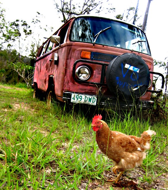
| The chicken is unnecessary. It would be an amazing shot without it. |
|
Comments Made During the Challenge  |
|
|
04/25/2006 01:49:43 PM |
interesting and boring-a mixture of opposites. Could have been better, had u managed to get a better angle...
7/10 from me and best of luck! |
|
 Photographer found comment helpful. Photographer found comment helpful. |
|
|
04/23/2006 01:14:08 PM |
| I was going to say... that chiken doesn't look so old... Then I saw the title and lol'd. Thanks for the laugh... |
|
| Photographer found comment helpful. |
|
|
04/23/2006 01:02:54 PM |
| I have nothing against vivid saturated colours... but done with good taste :) This is unreal and negativly unreal. I give it a 7 |
|
| Photographer found comment helpful. |
|
|
04/23/2006 08:01:44 AM |
| Brilliant composition! Well put together, amusing title. I like the slight angle of the shot, it adds interest. Good colour too. |
|
| Photographer found comment helpful. |
|
|
04/23/2006 07:35:23 AM |
| Pretty funny (like the humour) but without the title, not sure it would have been quite so interesting. Composition-wise, it's heavy on the right. Perhaps a little wait to get the chicken on the left so that it's diagonally balanced to the van could help. The shot is overall a little over-exposed. Still made me laugh - so 6! |
|
| Photographer found comment helpful. |
|
|
04/22/2006 04:15:55 PM |
| The chicken makes the shot!! |
|
| Photographer found comment helpful. |
|
|
04/21/2006 11:49:43 AM |
| cute! this is something i would do. |
|
| Photographer found comment helpful. |
|
|
04/21/2006 10:51:05 AM |
| Ooh, if only the colors didn't clash. The oversat is okay except on the grass. |
|
| Photographer found comment helpful. |
|
|
04/20/2006 06:23:04 PM |
| Seems a little over saturated but is still a great photo. |
|
| Photographer found comment helpful. |
|
|
04/19/2006 02:54:58 PM |
| Nice and old... and I gave you a bonus point for the chicken. Good job... |
|
| Photographer found comment helpful. |
|
|
04/19/2006 02:01:24 PM |
|
| Photographer found comment helpful. |
|
|
04/19/2006 01:10:25 PM |
| This title deserves a 10! |
|
| Photographer found comment helpful. |
|
|
04/19/2006 09:29:00 AM |
Great juxtaposition! The blown out sky detracts from teh overall image. YOu also need abit more shadow detail around the lower edge of the tire and front
bumper. |
|
| Photographer found comment helpful. |
|
|
04/19/2006 07:25:41 AM |
| Classic ,i like the collor good stuff ,b&w and sepia are not always the solution for old and this image just prooves it 8 |
|
| Photographer found comment helpful. |
Home -
Challenges -
Community -
League -
Photos -
Cameras -
Lenses -
Learn -
Help -
Terms of Use -
Privacy -
Top ^
DPChallenge, and website content and design, Copyright © 2001-2025 Challenging Technologies, LLC.
All digital photo copyrights belong to the photographers and may not be used without permission.
Current Server Time: 03/12/2025 04:23:12 PM EDT.