| Author | Thread |
|
|
04/28/2006 12:04:34 AM |
*Howdy for the Critique Club*
First of all, you have a wonderful shot.
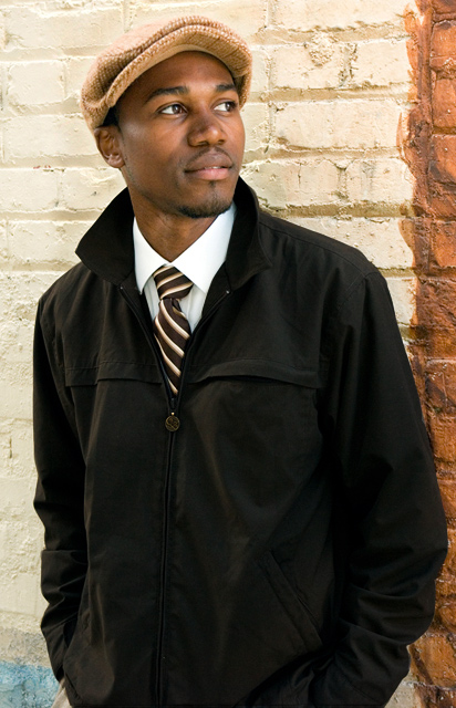
Like how he is looking away. I also like complimentary lines. The pockets on his jacket and the collar of his shirt, jacket and tie. Also horizontal line on the jacket and the blocks in the building, in shapes of the mustache and the brim of the hat.
Things that might improve this shot would be removing the blue and maybe the brown edge. The blue really has no point of interest to me. His hands are out of the shot, maybe just cropped out. The brown edge is so far over, might as well not even be there or moved Him, to lets say a third of it.
I seen in your comments box that his hat blended in with the bricks, burn and dodge are ok, but you can just use a curves adjustment to change also. Simple S curve and when your done, in your mask paint with black over everything but the wall and man this is so much easier. Thus giving more contrast. And reducing the halo look around the hat.
Well that's about it, you keep up the great work!
Have a great day, Mark Thomas Kelsay. |
|
 Photographer found comment helpful. Photographer found comment helpful. |
|
|
04/24/2006 10:20:01 AM |
| Lovely photo and one of my top picks from the challenge. |
|
| Photographer found comment helpful. |
Comments Made During the Challenge  |
|
|
04/23/2006 11:43:36 PM |
| Excellent portrait! On my short list at the top! |
|
| Photographer found comment helpful. |
|
|
04/23/2006 02:12:22 PM |
| The relaxed pose and the background really make the mood of this shot. Very nice. |
|
| Photographer found comment helpful. |
|
|
04/20/2006 08:32:22 PM |
| Great shot. Looks like a GQ Fashion shot. |
|
| Photographer found comment helpful. |
|
|
04/20/2006 03:59:53 PM |
| Very, very nice. Caught everything you needed to catch. |
|
| Photographer found comment helpful. |
|
|
04/19/2006 06:31:42 PM |
| A practice shot for GQ~! Nice one. |
|
| Photographer found comment helpful. |
|
|
04/19/2006 02:37:43 PM |
| Wonderful shot... Love the background and how it complements the clothing. Good light on the eyes. I like it A LOT!!! |
|
| Photographer found comment helpful. |
|
|
04/19/2006 04:14:34 AM |
| refreshing pose by model, and pleasing lighting. |
|
| Photographer found comment helpful. |
|
|
04/18/2006 10:57:43 PM |
| Nice lighting and I like the background texture. |
|
| Photographer found comment helpful. |
|
|
04/18/2006 05:08:01 PM |
|
| Photographer found comment helpful. |
|
|
04/18/2006 03:08:47 PM |
| i liek this photo nice colors and lighting, calm pose... |
|
| Photographer found comment helpful. |
|
|
04/18/2006 12:47:42 PM |
| Very nice studio-like portrait. |
|
| Photographer found comment helpful. |
|
|
04/17/2006 02:12:38 PM |
| I like this shot a lot. I like that it is outdoors and that he is looking at something out of our sight. I think the outfit makes me feel like this might be a magazine/catalog ad, but it's very nicely done. |
|
| Photographer found comment helpful. |
|
|
04/17/2006 10:52:52 AM |
|
| Photographer found comment helpful. |
|
|
04/17/2006 03:10:04 AM |
| Well done. I like the contrast and the fact that you included the brown bricks on the right - 10 from me! |
|
| Photographer found comment helpful. |
|
|
04/17/2006 01:04:43 AM |
| The lighting on this is really good. Nice focus. Maybe a tad tight on the crop. |
|
| Photographer found comment helpful. |
Home -
Challenges -
Community -
League -
Photos -
Cameras -
Lenses -
Learn -
Help -
Terms of Use -
Privacy -
Top ^
DPChallenge, and website content and design, Copyright © 2001-2025 Challenging Technologies, LLC.
All digital photo copyrights belong to the photographers and may not be used without permission.
Current Server Time: 03/12/2025 08:50:45 AM EDT.