| Author | Thread |
|
|
05/27/2006 04:01:01 PM |
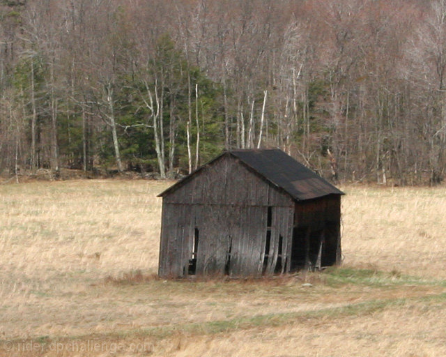
| I would try a different composition on this one. Zooming out would have worked well, especially if you keep in mind the rule of thirds.Having this lonely looking house sitting in a vast empty landscape would really emphasize what you are going for. The photo could also do with some sharpening and white balance adjustment. Great subject though! |
|
 Photographer found comment helpful. Photographer found comment helpful. |
Comments Made During the Challenge  |
|
|
04/23/2006 12:59:30 PM |
| i'd give it a bit more room on both sides. 8 |
|
| Photographer found comment helpful. |
|
|
04/23/2006 03:56:13 AM |
| it's very blurry and uninteresting...perhaps move around and see if there is a better perspective og this old building...as it is it looks bland and uninspiring |
|
| Photographer found comment helpful. |
|
|
04/21/2006 09:51:39 PM |
| number of composition problems. You have the grass and treeline split at 50% and then you center up the hut. Shifting the camera to place the house in the lower right corner and setting the treeline at a rule of third would help this picture. |
|
| Photographer found comment helpful. |
|
|
04/21/2006 09:13:20 PM |
| Needs to be sharper, more color saturation. |
|
| Photographer found comment helpful. |
|
|
04/21/2006 02:29:59 AM |
|
| Photographer found comment helpful. |
|
|
04/20/2006 01:31:15 PM |
| Image looks out of focus and washed out. Perhaps more contrast would help, also not having the shack so centered would improve the composition. |
|
| Photographer found comment helpful. |
|
|
04/20/2006 12:13:14 PM |
| The shot seems a little soft to me. I like the faint line of green heading to the building... perhaps moving the building a bit more out of the center of the shot would also help? |
|
| Photographer found comment helpful. |
|
|
04/19/2006 05:03:48 PM |
| Seems a little soft, or slightly out of focus. Would like to see it fill the frame a bit more too. Definitly old, good job. |
|
| Photographer found comment helpful. |
|
|
04/19/2006 04:07:55 PM |
| i might've cropped this a little tighter, nice shot tho |
|
| Photographer found comment helpful. |
Home -
Challenges -
Community -
League -
Photos -
Cameras -
Lenses -
Learn -
Help -
Terms of Use -
Privacy -
Top ^
DPChallenge, and website content and design, Copyright © 2001-2025 Challenging Technologies, LLC.
All digital photo copyrights belong to the photographers and may not be used without permission.
Current Server Time: 03/12/2025 09:41:33 AM EDT.