| Author | Thread |
|
|
05/01/2006 09:05:50 AM |
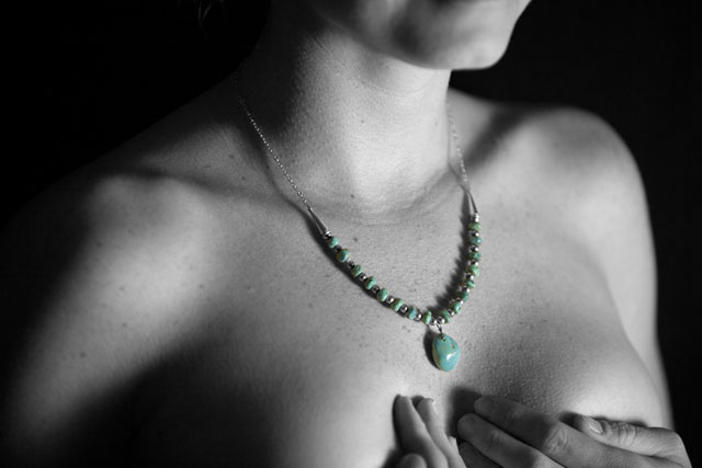
First, I like this shot, the idea behind it, the fact that you realize that a portrait is not defined strictly as a head and shoulders shot. The technical execution is spot-on. I even like the selective color, which is a rarity for me.
There's one thing that bugs me and I haven't seen anyone else mention it. It's the hands, in my opinion, they should either not be there at all, or they should be present in their entirety.
Either way, it's a very well-done shot that clearly has meaning for both of you, so enjoy. |
|
 Photographer found comment helpful. Photographer found comment helpful. |
|
|
04/29/2006 12:23:01 AM |
From the Critique Club:
There is very little about this shot that I don't like. So let's quickly go over what I do like in detail. First off, I love the fact that you left your models freckles and skin texture in the shot. There was really way to much neat image used in many of the shots entered into this challenge. Women (and men) really do have freckles, moles, birthmarks, pores and hair... Why do we as photographers insist on smudging them out of our images? Your focus here is spot on! Everything that needs to be in focus is acceptably in focus and your soft where a women is soft! Personally I like the fact that you chose to change this to b/w. B/W is a wonderful medium for the human form.
There are a couple of things that I don't like about this image. I'm not to sure about the crop. I think that it either needs to have more of her face included or less... I'm not sure which. I would need to see outtakes to truly decide on this matter. I don't think the choice of selective desat was the best one for this shot. I know that it has meaning to your and yours but to the world around you it's confusing. Why do you want me to look at your models necklace? Your model has an impression that goes around her neck. It looks like she was recently wearing a very tight necked blouse or t-shirt just before this shot. With the focal point of the shot (necklace) being so close to this crease in her skin it draws the eye to it. Cloning this out would have improved the shot or better yet, giving her time to let this impression smooth itself out would have been even better.
Why didn't it score better? I think you have gotten the answer already. You entered a basically black and white shot in a color themed challenge. You entered a portrait challenge with a shot that doesn't show your model's face. I know now and you know there is a story there, but it's not obvious to the voters. Because of these factors, a very nice shot got voted low. Believe me, it happens to all of us.
Very nice shot all around!
TC |
|
| Photographer found comment helpful. |
|
|
04/24/2006 12:25:16 PM |
The title is actually referring to the necklace. I bought the necklace for my girlfriend in New Mexico from a Navajo artist in Santa Fe. She is very attached to the Southwest and we had a wonderful time. The remembrance title is referring to her remembering our trip when she sees and wears the necklace.
The title actually was her idea...It obviously has too much "inside" meaning that the typical viewer would never be able to get from the image itself. I suppose a different title would have been more appropriate for a public challenge such as this.
What would you title this photo?
Message edited by author 2006-04-24 12:27:06. |
|
|
|
04/24/2006 09:08:54 AM |
I think it's beautiful. The way DOF has been used looks very decisive and adeptly controlled. You're a lucky dude, dude!
I'm still not quite sure what the remembrance is all about? Maybe you could post it in the photo description?
Is she getting older and missing her more youthful 'girls'? I was looking for a possible mastectomy or something medical. Sorry, but it is indeed a bit confusing. |
|
| Photographer found comment helpful. |
Comments Made During the Challenge  |
|
|
04/23/2006 09:59:43 AM |
| portraits involve faces don't they? |
|
|
|
04/23/2006 04:22:53 AM |
| Nice photo but it's not a portrait IMO (i.e. no face). |
|
|
|
04/22/2006 01:47:54 PM |
| Color portrait.....does this fit the challenge?! Anyway, letting go challenge theme, this is still a cool shot. I'd have given 9, but keeping theme in mind I'm cutting it down to 6. All said and done - this is lovely and different. |
|
|
|
04/22/2006 02:12:59 AM |
You know, I'm usually pretty loose with DNMC comments lately, but I really don't think this meets portrait in either of it's meanings very well. You're either showing me a person's face, and letting that tell me about them, or you're showing me something about the person in another fashion. The problem being here is, I don't know what you're trying to tell me with this, and I can't see their face. I'm sure the necklace has some significance, but you're not laying it out for me.
But, the lighting and pose are nice, the desat worked well to highlight the necklace. I think the extra exposed skin is more of a distraction than additive to whatever message you might have been going for. |
|
|
|
04/21/2006 12:54:01 AM |
|
|
|
04/20/2006 06:14:37 PM |
| Huh, I don't get the title. Nice lighting though. |
|
|
|
04/19/2006 05:33:40 AM |
| not quite a portrait to my taste.. |
|
|
|
04/18/2006 04:57:28 AM |
| This is good, but it is B&W. |
|
|
|
04/17/2006 02:18:31 PM |
| Was this image submitted in the wrong challenge? |
|
|
|
04/17/2006 01:58:56 PM |
| Color portraits show the face. This would be a good shot for a jewelry challenge. |
|
|
|
04/17/2006 07:57:31 AM |
| lovely lighting and selective desat...I am guessing this is Judy, but I could be wrong....Well done, hope you do well with this... |
|
|
|
04/17/2006 06:26:00 AM |
| I think that you missed out of when they said portrait. |
|
|
|
04/17/2006 05:35:36 AM |
| I don't get it. Perhaps if I did, the shallow depth of field wouldn't bug me as much as it does |
|
|
|
04/17/2006 04:42:58 AM |
| Rembering what? ... This is an interesting shot, but I find the story behind it a little short without the telling. |
|
Home -
Challenges -
Community -
League -
Photos -
Cameras -
Lenses -
Learn -
Help -
Terms of Use -
Privacy -
Top ^
DPChallenge, and website content and design, Copyright © 2001-2025 Challenging Technologies, LLC.
All digital photo copyrights belong to the photographers and may not be used without permission.
Current Server Time: 03/12/2025 01:44:16 AM EDT.