| Author | Thread |
|
|
04/30/2006 04:40:01 PM |
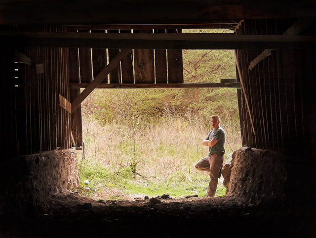
to be honest, i was shocked when I scrolled down and saw the score - definitely underrated in my book. Its a good, understated self-portrait, strong atmosphere lent by the old barn, and challenge link right on spot. The darkness leading in to the brighter centre works well, but when you look at it more its clear it is underexposed at the far outside, and overexposed. As this was Advanced Editing, I would have thought you could rescue some of it, although the best approach would have been to combine 2 exposures (so obviously out-of-challenge), keeping the dark a nd lihght, but saving the extremes.
Having now read through the other comments, I disagree with the challenge-meeting part - this portrait is nothing without the context of the barn, it does exactly what the title says it will. Guess everyone else has their own opinions of course |
|
 Photographer found comment helpful. Photographer found comment helpful. |
|
|
04/29/2006 11:39:47 PM |
ok, my first thoughts are:
the dark is too dark and the brights are unappealing.
it seems that the "subject" is the barn and that should garner just a bit more light to help show it off. i also think that maybe a prop (tractor, cow, saddle) would help give it more of a barn feel.
|
|
| Photographer found comment helpful. |
|
|
04/29/2006 09:38:36 PM |
this is a beutiful image, but not for this challenge.. unless you really feel that old ;)
the barn is not the subject in this photo but merely the frame, and that's what voters disliked..
since this is the image then lets concentrate on that rather than thinking of better ways to photograph...
there is some loss of details on your arm and back wich means the image is overexposed, and there is loss of details in the shadows that means the image is underexposed.. that can be a problem.. to get the correct exposure you need 2 images, one lit for the outside and one lit for the inside, and merge them together.
I think composition is good and I like the pose, looks relaxed.
this is a great photo for the family album. |
|
| Photographer found comment helpful. |
|
|
04/29/2006 08:24:13 PM |
I'm a fan of naturally framed compositions. This is a good one, as your highlighted area is balanced well with the lower portion comprised of the ground, and the left, right, and top, which allow a part of the brighter background to "bleed" through in an interesting way. Your subject (you) is well placed, offering further interest.
I believe this composition has a slightly "busy" feel to it that, to me, detracts somewhat. There's a lot going on in that bright background that we are asked to consider, giving the overall effect of a lack of compositional focus. Though I do indeed like it, your natural frame is rather heavy, and "pinches" the highlighted areas in a way that narrows the field of vision too much.
Despite the requirements of the challenge, I may have liked to see more emphasis on you, either with lighting or a different composition. Perhaps had you not opted for the rather formal and heavy framing, and just concentrated on a portion of the old building, the effect may have been strengthened. |
|
| Photographer found comment helpful. |
|
|
04/29/2006 04:37:30 PM |
| I always find this kind of picture difficult. You've done well. The lighting on the barn wood is good. I can see alot of detail in what is an obviously dark location. However, the grass in the background seems too light or washed out to me (the trees are better). I know the grass is a light color, which makes it tough, but I think the picture would be even better if there was not so much contrast between the barn interior and the grass. As for putting yourself in the picture, the pose you are striking tends to make the photo a 'snapshot' rather than a natural composition. If you were doing something that suggested that a person belongs in the picture (perhaps working with a shovel, fixing an old wagon wheel, or whatever) I think you would have strengthened your composition. I don't object to having you in the picture, it gives a focal point to an attractive setting. Overall, though, I think you did a good job (I know I wrestle with the same issues in my photos). |
|
| Photographer found comment helpful. |
|
|
04/29/2006 03:51:08 PM |
| I gave you a 5 on this one. The barn itself looks cool - though I would have liked to have seen more detail in the shadows. That board that cuts across takes away from the lines that you have going behind it. Maybe taken at a different time of day so that the outside light isnt such a contrast to whats going on inside. My eyes are more immediately drawn to the grass and trees rather than the barn. And then there is you. I am indifferent on that. Not sure if it adds or takes away. As far as the challenge goes, you weren't necessary (outside of the fact that you had to take the picture - my attempt at humor). Overall the shot has a good feel but more detail and different lighting could have made it stand out more. (I didnt read the other comments first this time - I will try to do this more often - great idea again this club thing) |
|
| Photographer found comment helpful. |
|
|
04/29/2006 09:28:20 AM |
| I'm going to comment without looking at other comments first, that way my perspective isn't affected by others opinions. For the challenge... I didn't vote in this one, but probably would have given you a 5. Whenever you put a person into the photo, it becomes the subject and you don't look that old. Without the challenge... it is a very nice picture, but one that would only appeal to people who know you. It reminds me of a vacation (I was here) type picture. If you could have done this at night and lighted up more of the barn and put yourself in silhouette (I know, that's bizarre!) in the opening, then you probably could have blown the competition away! |
|
| Photographer found comment helpful. |
|
|
04/28/2006 11:02:47 PM |
| Pretty cool idea, but I think that the dark area of the capture was overwhelming. I think if you added a small amount of fill flash inside the barn to bring out just a bit of the old wood detail, you would have scored a bit higher. It also suffers with the size requirements that we are given. A larger version would also bring out some of the detail. |
|
| Photographer found comment helpful. |
|
|
04/28/2006 10:18:56 PM |
| Now this I rather like! I suspect the biggest problem as far as score would be it didn't say "Old" to some. Compositionally, I like the way you've framed the opening, and it's overall balanced to me. You've done a pretty good job of a hard exposure - getting detail in both the dark and the light sections. Should you try it again and want to get down and dirty with post processing, I've heard taking the shot twice with two different exposures then combining the results can be done. But I couldn't tell you how, exactly. Overall, I find this a solid, appealing picture. |
|
| Photographer found comment helpful. |
Comments Made During the Challenge  |
|
|
04/23/2006 12:56:51 PM |
| What is the main subject, you or the barn? naturally I would think you, and you don't look so old. |
|
| Photographer found comment helpful. |
Home -
Challenges -
Community -
League -
Photos -
Cameras -
Lenses -
Learn -
Help -
Terms of Use -
Privacy -
Top ^
DPChallenge, and website content and design, Copyright © 2001-2025 Challenging Technologies, LLC.
All digital photo copyrights belong to the photographers and may not be used without permission.
Current Server Time: 03/18/2025 03:40:38 PM EDT.