| Author | Thread |
Comments Made During the Challenge  |
|
|
08/12/2003 08:10:52 PM |
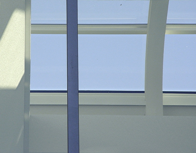
| I'm giving you credit for the two spots that under other circumstances would have been cloned out...great colors and very nice expression of the competition. |
|
 Photographer found comment helpful. Photographer found comment helpful. |
|
|
08/11/2003 07:45:48 PM |
| It might be a more powerful shot if you cropped out the portion of the wall with the light on it on the left. See what you think. |
|
|
|
08/08/2003 11:35:25 AM |
| the shapes in this photo are great, but the colors are kind of dingy. |
|
|
|
08/07/2003 04:06:13 AM |
| With all the horizonatal and veritical lines it reminds me of that artist that did those geometric paintings. Kinda like the L'oreal logo. Don't remember his name. I like this picture. Only thing that I don't like is the reflection on the left column. The shadows are otherwise very nice. |
|
| Photographer found comment helpful. |
|
|
08/06/2003 08:26:44 PM |
| challenge met, good composition, i know its abstract but not overly interesting to look at |
|
|
|
08/06/2003 04:14:43 PM |
| Lovely clean lines and simplicity, feels light and airy. very nice shot |
|
| Photographer found comment helpful. |
|
|
08/06/2003 12:40:39 AM |
| Meets challenge pretty well. The different colored beam really stands out. The dirt spot on the window is distracting as is the big white spot to the right. If those were gone it would improve the shot a lot I think. |
|
| Photographer found comment helpful. |
Home -
Challenges -
Community -
League -
Photos -
Cameras -
Lenses -
Learn -
Help -
Terms of Use -
Privacy -
Top ^
DPChallenge, and website content and design, Copyright © 2001-2025 Challenging Technologies, LLC.
All digital photo copyrights belong to the photographers and may not be used without permission.
Current Server Time: 03/12/2025 06:17:01 PM EDT.