| Author | Thread |
Comments Made During the Challenge  |
|
|
08/11/2003 01:24:26 PM |
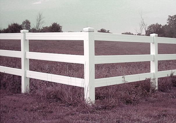
| The pink doesn't work for me on this shot. |
|
 Photographer found comment helpful. Photographer found comment helpful. |
|
|
08/11/2003 12:51:09 PM |
| The coloring in this shots gives it an eerie feeling but also seems to make the fence stand out. Good luck. |
|
| Photographer found comment helpful. |
|
|
08/11/2003 08:35:53 AM |
| Nice Photo here. The color and contrasting color of the fence is apealing to me. |
|
| Photographer found comment helpful. |
|
|
08/11/2003 05:09:02 AM |
| well done. I like the fence that really stands out at you. it has impact 6 |
|
| Photographer found comment helpful. |
|
|
08/10/2003 05:22:55 PM |
| I dislike the coloring in this. It detracts from the photo. |
|
| Photographer found comment helpful. |
|
|
08/08/2003 11:34:56 PM |
| colour looks really flat - almost like you desturated it, or tried for a sepia tone that missed the mark by a bit. lighting is good, and some definite strength in the angles. |
|
| Photographer found comment helpful. |
|
|
08/07/2003 03:37:11 PM |
| Remember the rule of thirds when composing or cropping a shot like this. |
|
| Photographer found comment helpful. |
|
|
08/07/2003 02:13:56 PM |
|
| Photographer found comment helpful. |
|
|
08/07/2003 06:24:34 AM |
| great subject and taken at a good angle. However, I find the background vegetation poking above the fence too distracting. Also, if you could adjust the levels to make the white of the fence even more distinct, then I think you'd have a really great shot. |
|
| Photographer found comment helpful. |
|
|
08/07/2003 05:46:16 AM |
| Whats up with the colors. Actually might look really good if you convert this image into a B&W image. Fix the contrast a little. Love the composition. |
|
| Photographer found comment helpful. |
|
|
08/07/2003 01:40:52 AM |
| needs a better angle and composition....centering is not the answer, it can work but the fence would have to be level. Shooting down might have worked. What kind of colors are these? |
|
| Photographer found comment helpful. |
|
|
08/06/2003 05:48:55 PM |
| Desaturation worked well here. |
|
| Photographer found comment helpful. |
|
|
08/06/2003 04:15:25 PM |
|
| Photographer found comment helpful. |
|
|
08/06/2003 05:50:55 AM |
| I enjoy the composition of this one, but the lighting/contrast seems off. |
|
| Photographer found comment helpful. |
|
|
08/06/2003 02:36:24 AM |
| forgive me if I am wrong...did you spot edit this?5 |
|
| Photographer found comment helpful. |
|
|
08/06/2003 01:31:20 AM |
Composition = 6
Challenge = 7
No clear 90's
Technical = 4
Colors sem off but not enough to look intentional, dark
Creativity = 5
X2 Wow factor = 5
32/6=5.3
rounds to = 5
congrats
|
|
| Photographer found comment helpful. |
Home -
Challenges -
Community -
League -
Photos -
Cameras -
Lenses -
Learn -
Help -
Terms of Use -
Privacy -
Top ^
DPChallenge, and website content and design, Copyright © 2001-2025 Challenging Technologies, LLC.
All digital photo copyrights belong to the photographers and may not be used without permission.
Current Server Time: 03/12/2025 02:47:46 AM EDT.