| Author | Thread |
Comments Made During the Challenge  |
|
|
04/30/2006 11:03:00 PM |
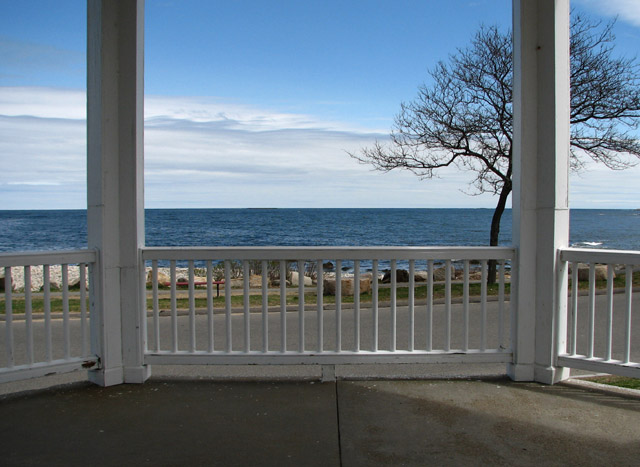
| Pretty view. Maybe the composition could be a little better if the horizon wasn't as much in the center? I get the feeling that the scene has been too evenly divided... But maybe this was the effect you were aiming for? I realize that you can't move the tree :) But I find myself wanting it to move more toward the center. |
|
|
|
04/30/2006 09:32:32 PM |
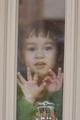
| Where is the window? Doesn´t really meet the challenge as far as I am concerned so I gave this a 2. |
|
|
|
04/29/2006 11:03:34 PM |
| The light and shadow in the foreground don't appear to have been thought about. Obscuring part of the tree seems accidental. Symmetry can make a photo look like a snapshot if carried out unimaginatively by a beginner. |
|
|
|
04/29/2006 09:34:02 PM |
| Pretty view, but not quite a window IMHO. Still, I like the execution and colors. (Nice place to live.) |
|
|
|
04/29/2006 04:31:42 PM |
| That's not a window, but I don't really care - beautiful and crisp! |
|
|
|
04/29/2006 04:25:56 PM |
| oh that's really a great scene...is it a window though? |
|
|
|
04/29/2006 12:29:38 PM |
| why didn't you crop the photo so you could only see the actual window? the fence and the foreground doesn't really add something to the photo IMO, and without it I think it would be a bit more interesting, also if you make the colors a bit more sparkling |
|
|
|
04/29/2006 11:40:32 AM |
| Very nive photo, love the colours and the outlook. good luck. |
|
|
|
04/29/2006 11:17:02 AM |
| Really nice view. Quite empty, but the tree adds just enough interest. The clouds are really nice too. |
|
|
|
04/29/2006 08:12:46 AM |
| Needs more frameing from a window. Also I would have liked to see the whole frame. The frame also cuts of the tree and that I don't like. |
|
|
|
04/29/2006 07:04:47 AM |
| Wonderful blue and cold colours here! I like the branches of the tree. The composition is nice but maybe could improve cropping the dark area down of the shot. Anyway, very nice. |
|
|
|
04/29/2006 02:42:28 AM |
| Great view. That latitude with the challenge theme will certainly result in a certain amount of low scores. I also would have liked the opening to really frame the image more. Crop in and catch the top of the porch to close off the frame. You should definitely revisit the tree as a subject if possible, perhaps from a similar vantage point. |
|
|
|
04/28/2006 05:04:35 PM |
| This picture would have looked better if you had cropped it a little tighter. However, that is only my opinion. |
|
|
|
04/25/2006 10:18:12 PM |
| That is an ocean view..very nice picture |
|
 Photographer found comment helpful. Photographer found comment helpful. |
Home -
Challenges -
Community -
League -
Photos -
Cameras -
Lenses -
Learn -
Help -
Terms of Use -
Privacy -
Top ^
DPChallenge, and website content and design, Copyright © 2001-2025 Challenging Technologies, LLC.
All digital photo copyrights belong to the photographers and may not be used without permission.
Current Server Time: 03/12/2025 02:32:32 AM EDT.