| Author | Thread |
|
|
05/22/2006 08:27:33 AM |
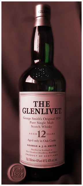
Thanks Eileen, I think you are one of the few that got what I was aiming for. However, I used PS CS to burn through my adjustment layer to show the bottle green through.
This turned out to be my lowest rated entry EVER! Ah Well, I'll try harder next time. |
|
|
|
04/26/2006 05:36:00 PM |
| I think this is a nice product shot and showing the year at the bottom was a nice touch. Some issues with the white and green reflection on the bottle neck which can be cloned out in PS and I would have preferred a little more detail in the dark areas. But I like the overall soft effect you chose. I gave it a 6. |
|
Comments Made During the Challenge  |
|
|
04/21/2006 05:01:17 AM |
I don't like the red color cast - could be fixed with quite many tools in Photoshop etc, such as using the levels tool and move the sliders for the green and blue channels to the left. It would have been nice had there been slightly more space above the bottle.
I think it would also have made for a much nicer image had you poured a bit of the wine in a wineglass and placed it in front and to the left or right of the bottle. The photo is a bit uninteresting as it is and it's often better to have a bit of a space to the sides for vertical subjects. |
|
 Photographer found comment helpful. Photographer found comment helpful. |
|
|
04/19/2006 12:46:12 PM |
|
Home -
Challenges -
Community -
League -
Photos -
Cameras -
Lenses -
Learn -
Help -
Terms of Use -
Privacy -
Top ^
DPChallenge, and website content and design, Copyright © 2001-2025 Challenging Technologies, LLC.
All digital photo copyrights belong to the photographers and may not be used without permission.
Current Server Time: 03/18/2025 03:44:12 AM EDT.