| Author | Thread |
Comments Made During the Challenge  |
|
|
04/24/2006 12:49:34 PM |
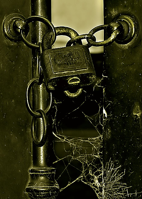
| Nice subject matter. It is a bit contrasty to me--super-dark shadow and very bright highlights but little detail in the midtones. Where I'd especially like to see a bit more detail is in the area of the padlock. My other issue is the greenish-yellow color cast that I'm seeing on my monitor (Mac calibrated to sRGB profile.) I prefer the whites to look more white and the blacks to be pure black but that is more of a personal preference. |
|
 Photographer found comment helpful. Photographer found comment helpful. |
|
|
04/21/2006 11:46:01 AM |
| looks like something sher would do, but not the cols. noice! |
|
|
|
04/20/2006 07:32:06 AM |
| This is such a great idea! I like the concept, but don't care for the excessive neat image. Also, I might have chosen a slightly wider crop, if possible, in order to make the lock less centered in the photo (this would add interest, in my opinion). The cobwebs at the bottom are my favorite touch here - nice! |
|
| Photographer found comment helpful. |
|
|
04/19/2006 09:08:43 PM |
Looks oversharpened from the halloing... Not so sure I like the processing into duotones...
TC |
|
| Photographer found comment helpful. |
|
|
04/19/2006 04:46:51 PM |
| Contrast is a little low for me, it just kind of all blends together, though I do get an "old" feeling from it. |
|
| Photographer found comment helpful. |
Home -
Challenges -
Community -
League -
Photos -
Cameras -
Lenses -
Learn -
Help -
Terms of Use -
Privacy -
Top ^
DPChallenge, and website content and design, Copyright © 2001-2025 Challenging Technologies, LLC.
All digital photo copyrights belong to the photographers and may not be used without permission.
Current Server Time: 03/12/2025 01:21:32 PM EDT.