| Author | Thread |
Comments Made During the Challenge  |
|
|
05/02/2006 05:09:31 PM |
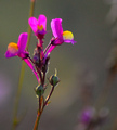
| Too dark and not sharp enough for me. |
|
|
|
05/02/2006 02:14:10 AM |
| needs colours boosted a bit... nicepic, but more focus and colours |
|
|
|
04/30/2006 09:29:06 PM |
| a little boring.. more interestign lighting |
|
|
|
04/30/2006 07:05:44 PM |
| very pretty, but it would have benefited from being lighter |
|
|
|
04/30/2006 03:53:57 PM |
| Seems a tad soft and the colors need to be stronger |
|
|
|
04/30/2006 09:17:34 AM |
| Clever title and good composition as well. This seems a little underexposed though. |
|
|
|
04/30/2006 08:02:49 AM |
| bad lighting and too blurry IMO |
|
|
|
04/30/2006 06:15:44 AM |
| Compostion is spot on, love the outlines of the leaves and petals, but the colours seem a bit flat and the grey background doesnt help matters. |
|
|
|
04/29/2006 12:37:13 PM |
| Nice composition and colors. It appears to me that hte focus could be a little sharper to help the over all impact, or a little softer to give it *emotion,* but right not, it is kinda stuck in the middle of the two. |
|
|
|
04/29/2006 09:36:51 AM |
|
|
|
04/28/2006 07:55:06 PM |
| some levels work in photoshop would be nice |
|
|
|
04/27/2006 04:14:43 PM |
|
|
|
04/27/2006 08:04:35 AM |
| red looks more like a dark fuscia, would like more of the shot to be in focus |
|
|
|
04/26/2006 11:21:23 PM |
|
|
|
04/26/2006 06:15:18 PM |
| 3 - This seems a victim of 'camera shake' and possibly pixelation issues pp, not sure. Sharper focus, variation in crop and composition, likely have helped this in my opinion. |
|
|
|
04/26/2006 10:22:34 AM |
| I think that it needs more light.... |
|
|
|
04/26/2006 05:13:11 AM |
| the focus just isn't crisp on this where it needs to be...I love the dof, but there is no real strong focal point |
|
|
|
04/26/2006 02:46:36 AM |
| Bit wrong to be complementary. Beautiful colours though. |
|
|
|
04/26/2006 12:51:11 AM |
|
Home -
Challenges -
Community -
League -
Photos -
Cameras -
Lenses -
Learn -
Help -
Terms of Use -
Privacy -
Top ^
DPChallenge, and website content and design, Copyright © 2001-2025 Challenging Technologies, LLC.
All digital photo copyrights belong to the photographers and may not be used without permission.
Current Server Time: 03/12/2025 07:29:12 AM EDT.