| Author | Thread |
Comments Made During the Challenge  |
|
|
04/30/2006 10:01:43 PM |
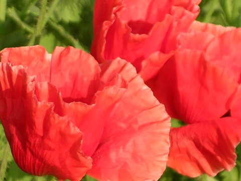
| Looks more like poppies than touch-me-nots (jewelweed). |
|
|
|
04/30/2006 07:32:41 PM |
| Should be sharper, I think. |
|
|
|
04/30/2006 06:42:52 PM |
| reminds me of a watercolor...nice |
|
|
|
04/30/2006 04:55:08 PM |
| interesting shot, i think if the two other blooms in the background were removed and the sharpness a bit better and the contrast boosted it might make this shot a bit better |
|
|
|
04/30/2006 11:25:25 AM |
| I believe you might have benefitted from a polarizer here to reduce washout and help pop the red. |
|
|
|
04/30/2006 11:20:33 AM |
| The primary colour are a little bit washed on this one. |
|
|
|
04/29/2006 02:35:52 PM |
| image lacks critical focus imho |
|
|
|
04/27/2006 01:23:07 PM |
|
 Photographer found comment helpful. Photographer found comment helpful. |
|
|
04/26/2006 08:01:12 PM |
|
| Photographer found comment helpful. |
|
|
04/26/2006 06:18:26 PM |
| 2 - Looks like good potential. Sharper focus, bigger (640 width), more control of the reds, a slight variation in angle/composition (allowing in more green and the petal 'chops' at more strategic places), make this better in my opinion. Also looks like you may have some pixelation/resizing/jpeg issues, not sure. Like to see the detail in the petal ruffles/crimping etc, which has not been captured, in my opinion. |
|
| Photographer found comment helpful. |
|
|
04/26/2006 07:11:49 AM |
| quite blurry and harsh...a little too small to comment on properly |
|
| Photographer found comment helpful. |
Home -
Challenges -
Community -
League -
Photos -
Cameras -
Lenses -
Learn -
Help -
Terms of Use -
Privacy -
Top ^
DPChallenge, and website content and design, Copyright © 2001-2025 Challenging Technologies, LLC.
All digital photo copyrights belong to the photographers and may not be used without permission.
Current Server Time: 03/18/2025 02:38:57 PM EDT.