| Author | Thread |
|
|
05/03/2006 06:09:23 PM |
| This should have ranked higher. A very fine composition and brilliant colors. |
|
Comments Made During the Challenge  |
|
|
05/02/2006 09:50:28 PM |
This is like one of those crappy tulip photos but on steroids mixed w/ crack and MAD SKILLS!
Ahem,....good job. |
|
|
|
05/02/2006 05:40:54 PM |
| I like the idea...I would have liked to see the colors "pop" a little more. |
|
|
|
05/02/2006 12:34:43 PM |
| nice minimalist composition with striking flow and lines. |
|
|
|
05/02/2006 10:39:41 AM |
|
|
|
04/30/2006 09:25:59 PM |
|
|
|
04/30/2006 08:08:14 PM |
|
|
|
04/30/2006 07:13:05 PM |
| Very nice studio setup, the lighting is good. Overall, a very good image. |
|
|
|
04/30/2006 05:44:19 PM |
| Simple and well done-- Solid 8 |
|
|
|
04/30/2006 02:53:24 PM |
| nice shot and use of color. |
|
|
|
04/30/2006 09:28:35 AM |
| good plant but the composition nees owrk. nice sharpness though. title needs work. 6. |
|
|
|
04/29/2006 02:55:17 PM |
| Nice details and shadows. |
|
|
|
04/29/2006 09:29:45 AM |
| nice capture and composition |
|
|
|
04/29/2006 06:28:00 AM |
|
|
|
04/29/2006 04:37:38 AM |
|
|
|
04/28/2006 10:04:29 PM |
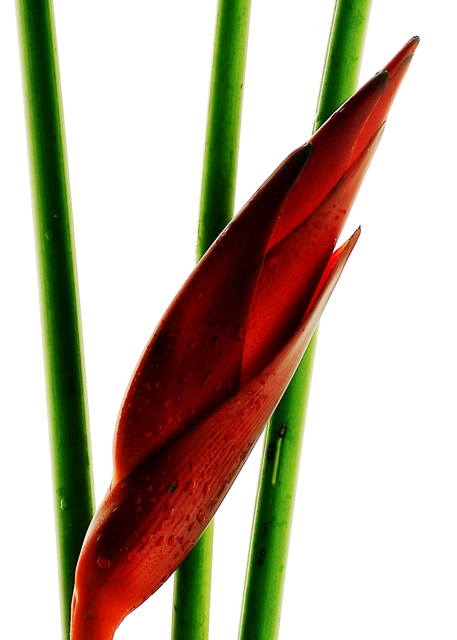
| Great! The brightness of the background makes it feel as tho you could reach out and grab that flower. Nice choice of color and amount of water. |
|
|
|
04/27/2006 08:32:25 PM |
| 7 - Nice. Like to see more detail in the heliconia though. Perhaps a little less contrast as well, not sure. |
|
|
|
04/27/2006 06:54:34 PM |
| Wonderful flower. Nice lighting, a bit to much white background imo. |
|
|
|
04/27/2006 03:54:19 PM |
| Perfect composition, colour and DOF. Good luck with this beauty. |
|
|
|
04/27/2006 11:31:27 AM |
| Very nice composition. Great framing and shadowing. The white background really accents the overall look. |
|
|
|
04/27/2006 08:51:07 AM |
| I would have liked this better with more light on the flower. |
|
|
|
04/27/2006 06:28:02 AM |
| My favourite flower shot in this challenge. Expertly done and beautiful framing. |
|
|
|
04/27/2006 04:37:38 AM |
| wow, this is just beautiful. water drops give it a nice twist too |
|
|
|
04/26/2006 11:23:17 PM |
|
|
|
04/26/2006 10:14:20 PM |
| Lovely. I like the deep tones of red creating the diagonal line. Nice use of negative space too. |
|
|
|
04/26/2006 01:20:39 PM |
| Excellent composition ! But I find the red a little bit too dark... |
|
|
|
04/26/2006 06:31:39 AM |
| great simple, effective...perhaps a little dark in the shadows |
|
Home -
Challenges -
Community -
League -
Photos -
Cameras -
Lenses -
Learn -
Help -
Terms of Use -
Privacy -
Top ^
DPChallenge, and website content and design, Copyright © 2001-2025 Challenging Technologies, LLC.
All digital photo copyrights belong to the photographers and may not be used without permission.
Current Server Time: 04/01/2025 09:11:56 PM EDT.