| Author | Thread |
|
|
07/15/2006 01:50:53 PM |
| I gave this a 6 but probably should have gone to 7. What I like about it is that it looks like a flag! If I start a country, can I use it? |
|
 Photographer found comment helpful. Photographer found comment helpful. |
|
|
05/04/2006 06:35:31 PM |
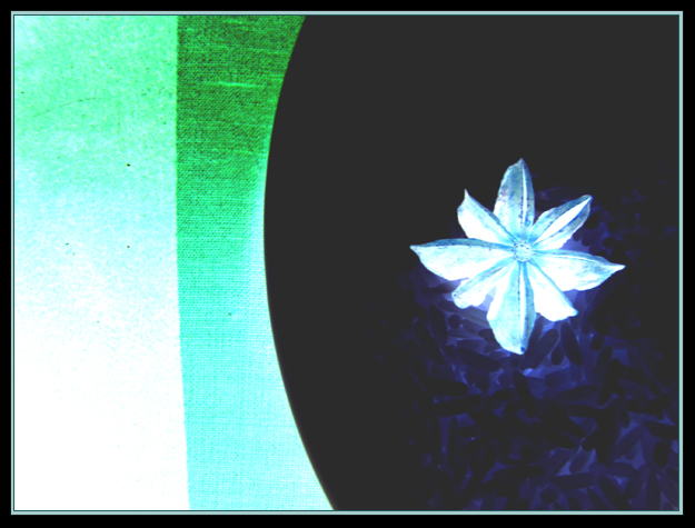
| I also agree with Rikki. I don't think this scored low because it was abstract or because the voters are "narrowminded". It scored low because it's just not a very appealing image to look at (that's partly subjective and partly not). Somewhere between 4 and 5 seems about right. Even if this was an "Abstract" challenge, I probably would've given it (and/or its negative/original) the same 4 or 5 score. |
|
| Photographer found comment helpful. |
|
|
05/04/2006 11:18:10 AM |
I agree with Rikki.
But I DO like the idea and composition. |
|
| Photographer found comment helpful. |
|
|
05/03/2006 11:43:43 PM |
Rikki summed it up well, but I'll add a bit.
I like the glowing blue rice, but would like to see more of it. Your intent may be to have some of it dark, but I'm just giving my opinion.
Also, the entire left of the picture looks "dirty" with the specs. Again, it's just my opinion.
I did not vote low because of the abstract nature of the picture, only for the reasons Rikki and I stated. |
|
| Photographer found comment helpful. |
|
|
05/03/2006 10:09:55 PM |
Hi Rebecca-
As promised yesterday here is my critique on this image. Please understand that I am being critical not to add fuel to the flame but I hope you find this helpful and insightful.
IMHO there are three areas that make an image successful in DPC. I will comment on each one based on your image.
Image appeal:
Unfortunately, the scores that this abstraction received is in line with my thoughts. I failed to vote on this image but if I were to hand a vote, I would say this would rank a 5 in my chart. Appeal is a big constituent in the flux of the votes on this site during the challenges. The challenge details specifically state
"Be creative and take an image that works well as a negative".
This image hardly has any appeal I'm afraid. The colors are cold and uninviting. Warm colors tend to score well and are far easier on the eyes. The dark area to the right attracts too much attention IMHO.
Technical
The image lacks sharpness and detail. There is visible noise and grain in the image. This could have been taken cared of using NI.
Uniqueness
Or the ability to stand out from the pack. Abstracts are a double edged sword. If done well, they score well. But you have to remember that it needs to be top notch. Your image is average so it's a toss up on whether voters will give you a 4 or a 5. At this point, the voters tend to look at the other areas.
I hope this makes sense and I hope it helps you improve.
|
|
| Photographer found comment helpful. |
|
|
05/03/2006 01:37:51 AM |
| Personally, I like this one. It has an artistic quality to it and almost looks like an oil painting. I could see it hanging on my wall;) |
|
Comments Made During the Challenge  |
|
|
04/30/2006 11:15:22 PM |
| What is this? Description said image must look good as a negative. I cannot make out what this is. |
|
|
|
04/26/2006 02:01:01 PM |
|
|
|
04/26/2006 07:14:30 AM |
| It's a pity the the texture of the rice(?) beneath the All Spice doesn't show up better. |
|
|
|
04/26/2006 04:58:43 AM |
| Apart from the flower I'm unsure what I'm looking at. This makes this a little too abstract for mine, which I don't think was the point of the challenge. |
|
Home -
Challenges -
Community -
League -
Photos -
Cameras -
Lenses -
Learn -
Help -
Terms of Use -
Privacy -
Top ^
DPChallenge, and website content and design, Copyright © 2001-2025 Challenging Technologies, LLC.
All digital photo copyrights belong to the photographers and may not be used without permission.
Current Server Time: 03/12/2025 05:45:22 PM EDT.