| Author | Thread |
|
|
08/09/2006 09:08:15 AM |
| �etta er geðveik mynd! skil ekki af hverju hún fékk ekki hærri einkunn... |
|
 Photographer found comment helpful. Photographer found comment helpful. |
|
|
05/03/2006 11:33:59 PM |
Greetings from the Critique Club...
Hi Hauxon :)
I think this is a very well thought out image, and you did catch a nice reflection and the essence of the challenge as well. The idea is great.
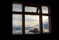
Compositionally, I believe there could possibly be room for improvement. Unfortunately, I can only guess at what lies outside the shown image area though. The dark area in the upper right corner is a bit of an eye-grabber. It creates a sharper contrast that is rather far from the subject area of the image. I don't know if you could have composed that element out or not by moving to one side or the other... it's hard for me to tell... I also don't know if you could have elevated the camera a little more to make it more of a face-on photo... low enought to keep yourself out of the reflection but high enough to eliminate that corner...
At any rate, it's a good shot... I think it's a little underrated :)
John Setzler
|
|
| Photographer found comment helpful. |
|
|
05/01/2006 01:51:50 PM |
|
| Photographer found comment helpful. |
Comments Made During the Challenge  |
|
|
04/30/2006 11:35:47 PM |
|
| Photographer found comment helpful. |
|
|
04/30/2006 10:02:34 PM |
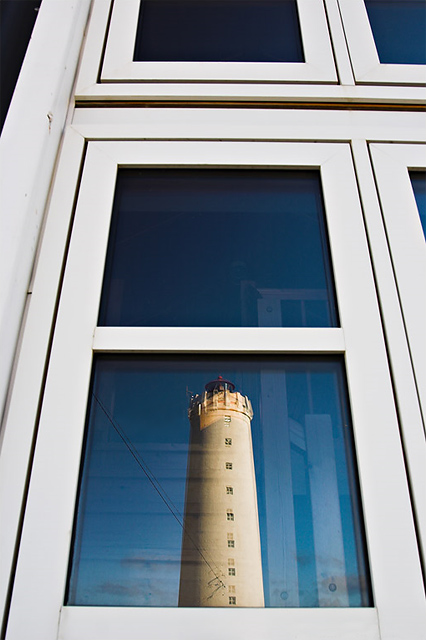
| I know this lighthouse! :) Allt that window seems a bit extravagant though, I could have lived without the top window. |
|
| Photographer found comment helpful. |
|
|
04/30/2006 09:32:10 AM |
| I would like this more if you could've killed the interior reflection. Nice blues and yellows. |
|
| Photographer found comment helpful. |
|
|
04/29/2006 08:52:52 PM |
| I think a less centered image would be much more dramatic and mysterious. I really do like this however with the white windows and relections. |
|
| Photographer found comment helpful. |
|
|
04/29/2006 08:14:49 PM |
| I would have cloned out the power lines. Just a minor item. |
|
| Photographer found comment helpful. |
|
|
04/29/2006 02:04:08 PM |
| very nicely captured. using the polarizer really makes those skies pop dont they? |
|
| Photographer found comment helpful. |
|
|
04/29/2006 12:43:02 PM |
| Nice idea! Wonder if there was a way you could have captured it such that the lighthouse reflection covered both panes. |
|
| Photographer found comment helpful. |
|
|
04/29/2006 11:28:44 AM |
| Great shot with strong colours. I like it alot, good luck. |
|
| Photographer found comment helpful. |
|
|
04/29/2006 08:58:54 AM |
| Interesting composition, the lack of perfect symmetry puts me off. Some great colours though. |
|
| Photographer found comment helpful. |
|
|
04/29/2006 08:30:27 AM |
| It would have looked better with out the tthings inside the window distracting me. |
|
| Photographer found comment helpful. |
|
|
04/29/2006 07:23:43 AM |
| Nice composition. Good crop |
|
| Photographer found comment helpful. |
|
|
04/29/2006 06:59:37 AM |
| I like the effect of the framed window looks like a tower extension repeting the square windows in the original tower. It is original and works. Maybe some reflections are annoying or unnecessary. |
|
| Photographer found comment helpful. |
|
|
04/29/2006 06:13:26 AM |
interesting image odd perspective
I like the lighthouse |
|
| Photographer found comment helpful. |
|
|
04/29/2006 02:25:55 AM |
| Great job and subject choice. I like the exposure. |
|
| Photographer found comment helpful. |
|
|
04/28/2006 10:13:35 PM |
| I would crop off the top window pane... |
|
| Photographer found comment helpful. |
|
|
04/28/2006 08:42:00 PM |
Skyldi það vera úti á Gróttu? Rámar à að hafa séð þennan vÃr þar.
Ã�gæt hugmynd og fÃn mynd.
�g hefði samt látið tvo glugga duga. |
|
| Photographer found comment helpful. |
|
|
04/28/2006 04:35:48 PM |
| I like the lighthouse in the window, but I don't like the original window. The shape (or the crop) does nothing for the photo. |
|
| Photographer found comment helpful. |
|
|
04/25/2006 01:38:45 PM |
| This is really nice, love the white and blue, they go so well together. I might have cropped off the top windows, but it's still pretty good as is. |
|
| Photographer found comment helpful. |
|
|
04/25/2006 01:25:41 PM |
| a polrizing filter would have reduced some of the glare....and allowed the subject to be more pronounced. |
|
| Photographer found comment helpful. |
|
|
04/25/2006 11:03:55 AM |
| Interesting shot. I like the colors and the depth (height) of the window above. Helps make the lighthouse stand out nicely. |
|
| Photographer found comment helpful. |
|
|
04/24/2006 11:57:49 PM |
|
| Photographer found comment helpful. |
|
|
04/24/2006 02:07:02 PM |
| I think this might have had more impact if the top windows were cropped out. |
|
| Photographer found comment helpful. |
Home -
Challenges -
Community -
League -
Photos -
Cameras -
Lenses -
Learn -
Help -
Terms of Use -
Privacy -
Top ^
DPChallenge, and website content and design, Copyright © 2001-2025 Challenging Technologies, LLC.
All digital photo copyrights belong to the photographers and may not be used without permission.
Current Server Time: 03/12/2025 02:08:26 AM EDT.