| Author | Thread |
Comments Made During the Challenge  |
|
|
05/01/2006 05:12:47 AM |
|
 Photographer found comment helpful. Photographer found comment helpful. |
|
|
04/30/2006 10:26:18 PM |
|
| Photographer found comment helpful. |
|
|
04/30/2006 06:59:46 PM |
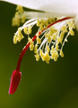
| lovely, but i would have had larger droplets, and i would have zoomed in some |
|
| Photographer found comment helpful. |
|
|
04/30/2006 06:09:37 PM |
| I like the lighting on this, and the mist is a nice touch. |
|
| Photographer found comment helpful. |
|
|
04/30/2006 04:46:03 PM |
| good capture, perhaps a bit more red in the background |
|
| Photographer found comment helpful. |
|
|
04/30/2006 03:37:39 PM |
| Nice leaf shot with cool design. The red in the background needs to be more saturated |
|
| Photographer found comment helpful. |
|
|
04/30/2006 02:50:42 PM |
| Nice composition. clean and nice lighting. |
|
| Photographer found comment helpful. |
|
|
04/30/2006 11:41:23 AM |
| Cool leaf but the contrast isn't enough for me. |
|
| Photographer found comment helpful. |
|
|
04/30/2006 09:36:42 AM |
doesnt fit the challenge but nice focus.
dont like the drops |
|
| Photographer found comment helpful. |
|
|
04/30/2006 06:58:14 AM |
| Thats insanely sharp! If the background was a bit brighter I think you would be onto something ;) |
|
| Photographer found comment helpful. |
|
|
04/29/2006 11:26:45 PM |
| Great example of complementary colours, the water droplets add quite a bit to the photo and I like the composition. Well done and good luck. |
|
| Photographer found comment helpful. |
|
|
04/29/2006 08:33:33 PM |
|
| Photographer found comment helpful. |
|
|
04/29/2006 02:29:37 PM |
| love the blurred background. the dew drops are a great add to this image |
|
| Photographer found comment helpful. |
|
|
04/29/2006 02:06:59 PM |
| not a bad capture good sharpness and detail |
|
| Photographer found comment helpful. |
|
|
04/29/2006 08:35:36 AM |
| The red should be brighter for a real complement.(and compliment)! Otherwise quite nice. |
|
| Photographer found comment helpful. |
|
|
04/28/2006 03:28:42 PM |
| Not enough of the red background to make it a complementary colour for me |
|
| Photographer found comment helpful. |
|
|
04/27/2006 08:42:46 PM |
| 4 - Like to have seen the 'red' tweaked pp, coming over more brown in my opinion. Don't mind the composition and detail looks quite good, but 'bigger' would have helped you - color issues aside. |
|
| Photographer found comment helpful. |
|
|
04/26/2006 10:21:55 AM |
| Love it. The background seems more brown than red - but it's a gorgeous image. |
|
| Photographer found comment helpful. |
|
|
04/26/2006 06:58:13 AM |
| Loved this non-Christmas red and green combination. Comp is wonderful. 9 |
|
| Photographer found comment helpful. |
|
|
04/26/2006 06:41:22 AM |
| good shot...the red background could have been better to really make the green pop |
|
| Photographer found comment helpful. |
Home -
Challenges -
Community -
League -
Photos -
Cameras -
Lenses -
Learn -
Help -
Terms of Use -
Privacy -
Top ^
DPChallenge, and website content and design, Copyright © 2001-2025 Challenging Technologies, LLC.
All digital photo copyrights belong to the photographers and may not be used without permission.
Current Server Time: 03/12/2025 10:16:36 PM EDT.