| Author | Thread |
Comments Made During the Challenge  |
|
|
04/30/2006 10:07:38 PM |
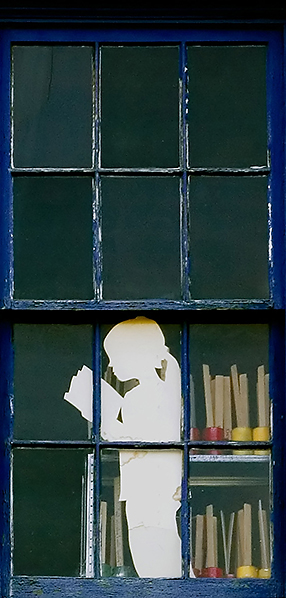
| Sorry but the textureless WHITE silhouette isn´t really winning me over, I feel I am looking at a piece of a white cardboard cut out like a little girl, not a real person. |
|
|
|
04/30/2006 05:54:19 PM |
| looks like you used a cardboard cutout as your subject... |
|
|
|
04/30/2006 02:10:07 PM |
|
|
|
04/30/2006 01:30:14 PM |
| Difficult one. Good, but get the feeling it is too tightly cropped. Would love to see the original to get some idea. 6 |
|
 Photographer found comment helpful. Photographer found comment helpful. |
|
|
04/30/2006 12:07:13 PM |
| I wonder what the rest of the building looks like. Maybe next time dont crop it all out. |
|
| Photographer found comment helpful. |
|
|
04/29/2006 06:07:49 PM |
| doesn't really grab my attention. would have liked to see some of the building which this window is in. |
|
| Photographer found comment helpful. |
|
|
04/29/2006 04:27:13 PM |
| I'm a sucker for old peeling windows. Nice contrast with the white cut-out. |
|
| Photographer found comment helpful. |
|
|
04/29/2006 12:34:56 PM |
| I really like the old window, the chipped "it's-been-painted-23-times" look, the crop and shape of it, but the kids cut-out being white, takes away from that rustic feel I got when I first came upon it. |
|
| Photographer found comment helpful. |
|
|
04/28/2006 08:32:51 AM |
| sorry, the folders in the background distract from the simplicity of the photo |
|
| Photographer found comment helpful. |
|
|
04/28/2006 01:25:15 AM |
| nice color, red/yellow/and blue |
|
| Photographer found comment helpful. |
|
|
04/27/2006 07:54:49 PM |
| a little too obvious its a cut out.. unless you were trying to make it obvious, in which case goood! |
|
|
|
04/27/2006 03:04:01 AM |
Fits challenge=5
Color/lighting=1
DOF/focus=1
Wow factor/uniqueness=0
Attractiveness=1
nice, I love the old windows and how you composed it. Good luck |
|
| Photographer found comment helpful. |
|
|
04/26/2006 11:41:45 AM |
| I would like it more if the sillouete (sp?) were black. also i think you could have cut off the top row of frames |
|
| Photographer found comment helpful. |
|
|
04/24/2006 06:24:29 AM |
| That's not a real person who do you think you're fooling ;-) 6 |
|
| Photographer found comment helpful. |
Home -
Challenges -
Community -
League -
Photos -
Cameras -
Lenses -
Learn -
Help -
Terms of Use -
Privacy -
Top ^
DPChallenge, and website content and design, Copyright © 2001-2025 Challenging Technologies, LLC.
All digital photo copyrights belong to the photographers and may not be used without permission.
Current Server Time: 03/12/2025 02:50:45 AM EDT.