| Author | Thread |
Comments Made During the Challenge  |
|
|
04/30/2006 11:08:07 PM |
| creative!! love the title and what you have done! |
|
 Photographer found comment helpful. Photographer found comment helpful. |
|
|
04/30/2006 07:35:50 PM |
| Composition feels balanced, but needs something extra to raise this above the commonplace. |
|
| Photographer found comment helpful. |
|
|
04/30/2006 03:35:22 PM |
| Nice but compared to the rest of the challenge, this is very mediocre, it needs some kind of main subject in the window, like a person looking out. At least I can´t connect with this photo without a main subject. 5 from me. |
|
| Photographer found comment helpful. |
|
|
04/30/2006 02:07:48 PM |
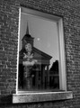
| Nice image. The window as the subject in the window cool. |
|
| Photographer found comment helpful. |
|
|
04/30/2006 10:33:52 AM |
| Dosen't really hold my interest. |
|
| Photographer found comment helpful. |
|
|
04/29/2006 11:36:49 PM |
| Perfect for the challenge! The contrasting angles between the two windows work well and I love the simple color scheme. About the only thing I'd change is to somehow tone down the brightness on the wall on the right. Nice work. |
|
| Photographer found comment helpful. |
|
|
04/29/2006 07:46:12 PM |
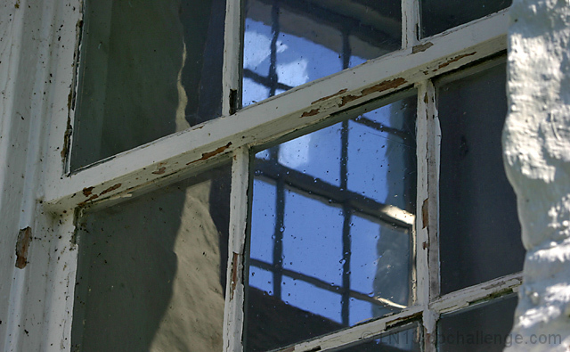
| I love the peeling paint. Interesting picture |
|
| Photographer found comment helpful. |
|
|
04/29/2006 04:06:59 PM |
|
| Photographer found comment helpful. |
|
|
04/29/2006 01:58:51 PM |
| hehehhehee.... i like the way youre thinking here ;) |
|
| Photographer found comment helpful. |
|
|
04/29/2006 12:59:47 PM |
| good idea but not very interesting photo... the concrete wall to the right distracts.. a vertical framed photo of the center would have been better.. |
|
| Photographer found comment helpful. |
|
|
04/28/2006 04:37:20 PM |
| This is a very interesting window but I wonder if it wouldn't have looked better in a vertical shot. However, that is a subjective thought. |
|
| Photographer found comment helpful. |
|
|
04/28/2006 08:42:35 AM |
| nice idea, i just think it's a bit too busy |
|
| Photographer found comment helpful. |
|
|
04/28/2006 07:54:29 AM |
|
| Photographer found comment helpful. |
|
|
04/26/2006 11:31:50 PM |
| Seems to tightly cropped. It might be better if this shot were taller. |
|
| Photographer found comment helpful. |
|
|
04/25/2006 10:06:13 PM |
|
| Photographer found comment helpful. |
|
|
04/25/2006 09:14:26 PM |
| good diagaonals, maybe a little dark on the LH side |
|
| Photographer found comment helpful. |
|
|
04/25/2006 12:30:58 PM |
| nice concept. I do like the blue in a field of gray. The slight OOF on the right is a bit distracting. maybe it is the highlight rather than the DOF that is the distraction. Some burning may have been good there. 6 |
|
| Photographer found comment helpful. |
Home -
Challenges -
Community -
League -
Photos -
Cameras -
Lenses -
Learn -
Help -
Terms of Use -
Privacy -
Top ^
DPChallenge, and website content and design, Copyright © 2001-2025 Challenging Technologies, LLC.
All digital photo copyrights belong to the photographers and may not be used without permission.
Current Server Time: 03/12/2025 02:44:05 AM EDT.