| Author | Thread |
|
|
05/02/2006 07:39:54 AM |
| Hey there - running a bit behind on commenting and as I havent been reading the comments here before writing my own, I did read yours in the thread. It seems that mine would not be much different. I didnt notice the man unstil you mentined where he was. Having him somewhere else more pronounced in the shot would have helped. Tripod would have helped big time. It is an interesting idea and it is nice to see people thinking out of the norm. Keep going at it and you will soon succeed. |
|
 Photographer found comment helpful. Photographer found comment helpful. |
|
|
05/02/2006 02:35:15 AM |
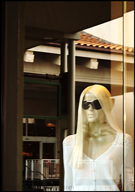
| This shot obviously failed (especially without a tripod to help me sharpen the focus - although the thick plate glass window hinders a sharp focus too). Having said that, this was the intent... I had a polarizer lens on the camera and intentionally left all of the reflections (which most people found distracting) in the image because one of the reflections was the face of "her man" in the lower right corner. I left the line in the glass in the shot (after experimenting with cropping it out) because I wanted an artificial division between the mannequin and the real man...a sort of contrast between artificial person and real person. If I had cropped the line out or reduced the reflection to improve the clarity I would have lost the point of the shot. So I went with this one. I guess the failing is that it doesn't work. I need to rework either the idea or the execution, or both. I knew I would be hammered for this shot (I have tried something similar with a mannequin before and was scored down) but I still wanted to test the idea. Nothing ventured, nothing gained...or even learned. Your comments are appreciated because the learning part is critical for me. Thanks. |
|
|
|
05/01/2006 09:27:25 PM |
| I gave you a 5 and am rather suprised to see it finish as low as it did. It's kinda quietly unique. Met the challenge, yes, but what I think may have hurt your score was the very busy and distracting background. You note that you shot at 5.6 - not sure if shooting at a wider aperature might have helped or not, but your best bet would probably to have found a different angle of attack if at all possible. Based on the title, I also found myself trying to find "the man" referenced. There's a small face in the corner, but it's not readily apparent. |
|
| Photographer found comment helpful. |
|
|
05/01/2006 08:58:09 PM |
I think we have a softness issue with this image overall, though it could be argued that the interesting mix of elements asks for focus that is not razor-sharp. There is an interesting mix of elements, with the "new wave" kind of mannequin (hope I don't sound too old), the ceramic tiled roof that gives a rather old-world feel, and some kind of entrance that looks like it belongs in a modern shopping mall. I personally like that kind of composition.
But I think there's a lack of focus on anything. Was it intentional, or perhaps was your camera focused on the glass reflections? The elements that are dark give this image a left-handed weight that detracts for me. The join in the panes of glass at right are another distracting element.
This could have been improved, perhaps, by more selecting choosing your subject when shooting, with better focus.
Message edited by author 2006-05-01 20:59:51. |
|
| Photographer found comment helpful. |
|
|
05/01/2006 06:08:31 PM |
Hmmmm, I've tried to make it say something to me, but I just can't. Seems as though it could have something if you were making some comment on consumerism or fashion, or purely harking back to Dr Who-style mannequin monsters, but with the title "Reflectively Staring at Her Man" it just seems a shot through a window that was entered just in order to enter something.
The more I look at it, the more I dislike the title - it shouldn't be an issue, but it obviously is here on DPC, and I would even have prefered it untitled.
Maybe if the focus wasn't just on her, but there was some context given, by shoppers walking by, and her gaze unchanged or something, maybe that could work...Sorry I don't really have any suggestions for improvement, its just that the subject matter doesn't do anything for me. |
|
| Photographer found comment helpful. |
|
|
05/01/2006 05:44:21 PM |
--Trading Post Comment--
This is just noy a very DPC friendly shot. They (we) need vibrant colors and lots of neat image to vote high on this site. The shot as a whole is not bad, but nothing really jumps out as an appealing subject. It seems that the most focused oart of the image is the wooden part of the window, thus pulling the viewer's eye to that spot with little interest. The composition is fine, but the shot just lacks some interest. I do not believe that titles make or break an image, but again, this is DPC. OFten we need to be told waht we need to think about an image. I rarely even read the title before I comment or vote for the shot. |
|
| Photographer found comment helpful. |
|
|
05/01/2006 05:28:49 PM |
| I see what you were going for...and I do see a man's reflection at the bottom corner, yet, it seems to be out of focus a bit. I didn't vote on this but probably would have been a 4. I'm sorry, but I really can't think of anything to improve the shot other than more focus. |
|
| Photographer found comment helpful. |
|
|
05/01/2006 04:31:06 PM |
hello again.
the major problem i had with this one was the title. it said staring at her man and i did not see her man. i was thinking ifn you could have put the reflection of a man (even you taking the photo) it would have been gallons better. your title gave me the idea. without someone reflecting it just like a manequin behind glass. i know that was the challenge.
having said that, your photography is good and i understood what you were doing by keeping the glass in the pic, and showing the reflections above her and still keeping her (fairly) sharp in the image. it was good like that, but i did not think that was enough. |
|
| Photographer found comment helpful. |
|
|
05/01/2006 01:01:41 PM |
[[Trading Post Comment]]
By reading your comment, I know you regret this shot :) It is always disappointing when we want so badly to submit and it just doesn't work out well, isn't it?
The reflection alone isn't bad, but it just doesn't make a lot of sense. I honestly don't have a lot of tips to offer for the shot; but I think the stripe down the right hand side of the picture is very distracting. Just my thoughts :) |
|
| Photographer found comment helpful. |
|
|
05/01/2006 02:51:51 AM |
Yes. It is definitely out of focus. I left my tripod home and should have left this shot in the camera. : )
Thanks for the comments. |
|
Comments Made During the Challenge  |
|
|
04/30/2006 11:17:44 PM |
|
| Photographer found comment helpful. |
|
|
04/30/2006 05:51:59 PM |
| this one seems a little bit out of focus, and the reflections arn't helping that much either |
|
| Photographer found comment helpful. |
|
|
04/30/2006 04:55:46 PM |
| Looks to be a little out of focus. |
|
| Photographer found comment helpful. |
|
|
04/30/2006 04:52:55 PM |
| higher shutter speed or a tripod would make this shot really nice and sharp. looks to me as if you were hand holding to slow for the llight. |
|
| Photographer found comment helpful. |
|
|
04/30/2006 11:30:21 AM |
| Try to keep your subject in focus next time, I promise you it will improve your score. |
|
| Photographer found comment helpful. |
|
|
04/30/2006 08:40:52 AM |
| ? This looks a mannequin looking out the window. |
|
| Photographer found comment helpful. |
|
|
04/29/2006 11:10:33 PM |
| Nothing appears to be in focus. |
|
| Photographer found comment helpful. |
|
|
04/29/2006 06:43:40 PM |
| The background is a little busy and its a tad oof but I like the crop and the tones 5 |
|
| Photographer found comment helpful. |
|
|
04/29/2006 04:09:56 PM |
Boy does she have a cold stare :)
The glare is a bit strong - the dummy isn't very sharply focused. |
|
| Photographer found comment helpful. |
|
|
04/29/2006 09:34:25 AM |
| I like the crop on this shot, only wish it were in better focus. The glare seems too distracting with the white dress. |
|
| Photographer found comment helpful. |
|
|
04/25/2006 04:04:14 PM |
| I think your entry is a bit out of focus and the composition doesn't really appeal to me. |
|
|
|
04/25/2006 03:24:40 AM |
| IMHO, it appears that this photo is blurred. Not sure if you meant for that, but I think it takes away from the composition. Just my opinion though... |
|
| Photographer found comment helpful. |
|
|
04/24/2006 05:31:56 PM |
|
| Photographer found comment helpful. |
|
|
04/24/2006 10:31:32 AM |
| Nice concept but focus could be sharper |
|
| Photographer found comment helpful. |
Home -
Challenges -
Community -
League -
Photos -
Cameras -
Lenses -
Learn -
Help -
Terms of Use -
Privacy -
Top ^
DPChallenge, and website content and design, Copyright © 2001-2025 Challenging Technologies, LLC.
All digital photo copyrights belong to the photographers and may not be used without permission.
Current Server Time: 03/12/2025 02:24:36 AM EDT.