| Author | Thread |
Comments Made During the Challenge  |
|
|
05/02/2006 11:43:38 PM |
|
|
|
05/02/2006 04:58:23 PM |
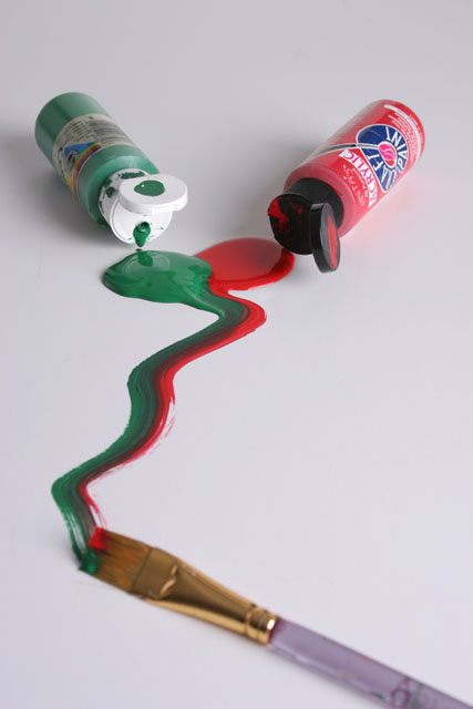
| Better lighting so the background is white would help. Also I think the brush should also be in foucus. |
|
|
|
04/30/2006 09:51:29 PM |
| Like the idea but the brush should be in focus also. Nice leading lines. |
|
|
|
04/30/2006 09:11:56 PM |
|
|
|
04/30/2006 08:06:10 PM |
| this is the most literal understanding of complementary colors i have seen, so i think that this should be a 10 |
|
|
|
04/30/2006 07:19:08 PM |
|
|
|
04/30/2006 02:29:34 PM |
|
|
|
04/30/2006 11:44:28 AM |
| The colors seem really dull, though it was a really good idea! |
|
|
|
04/30/2006 10:44:23 AM |
| Great concept and composition. |
|
|
|
04/30/2006 09:35:40 AM |
| not very original or interesting. a better focused brush could add to the photo. title doenst add much to the photo. 5. |
|
|
|
04/30/2006 06:44:58 AM |
| you lighting is really nice here. I'd just like the colours to be a bit more vibrant. |
|
|
|
04/30/2006 01:38:25 AM |
| Good idea. It is always hard to pull off having a soft foreground, especially when it is a subject. Try more light and a smaller aperture. |
|
|
|
04/29/2006 12:07:47 PM |
| nice idea... would have liked to see the white background more white ... (more than 245) I would have extended your DOF to the tip of the brush ...its ok that the brush it self falls off |
|
 Photographer found comment helpful. Photographer found comment helpful. |
|
|
04/29/2006 09:24:34 AM |
|
|
|
04/29/2006 01:54:28 AM |
| I wish the DOF had been long enough for the brush to be in focus as well... |
|
|
|
04/28/2006 03:18:34 AM |
| Simple, to the point, effectively meets the challenge nicely. 9 |
|
|
|
04/27/2006 07:59:48 PM |
| 5 - Don't mind the concept. The white base/lighting/something isn't enhancing the image nor colors as well as perhaps a different color (difficult) may have. Might just be the lighting though, not sure. Like to have seen perhaps a little sharper angle/perspective, with less brush handle and label detail on the bottles, and more on the colors/paint, if that makes sense. |
|
| Photographer found comment helpful. |
|
|
04/27/2006 07:09:40 PM |
I would have tried to have a bit better focus on the pencil. In this way, the main subject is distracting.
Nice idea and colours are good.
The corners of the photo seem a bit darker (vignetting) and should maybe have cut a bit more or but a bit more light in the picture. |
|
| Photographer found comment helpful. |
|
|
04/27/2006 08:48:17 AM |
| love how the paint just streams together |
|
|
|
04/26/2006 11:13:55 PM |
|
|
|
04/26/2006 07:26:58 AM |
| interesting shot...when you look at the tubes, sometimes they look like they are on the bench other times they look like they are in mid air...it's one of those shots that trick your eyes - especially the red tube...good shot |
|
| Photographer found comment helpful. |
|
|
04/26/2006 05:48:24 AM |
|
|
|
04/26/2006 02:53:14 AM |
|
Home -
Challenges -
Community -
League -
Photos -
Cameras -
Lenses -
Learn -
Help -
Terms of Use -
Privacy -
Top ^
DPChallenge, and website content and design, Copyright © 2001-2025 Challenging Technologies, LLC.
All digital photo copyrights belong to the photographers and may not be used without permission.
Current Server Time: 04/26/2025 03:03:36 PM EDT.