| Author | Thread |
Comments Made During the Challenge  |
|
|
05/02/2006 12:22:35 PM |
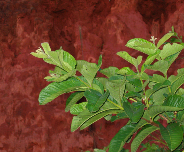
| it's useful to think about why we are taking these kinds of images--the background does not look attractive and there is no detail, lines or graphic interest in the plant at the angle in which its been taken. |
|
|
|
05/01/2006 07:27:14 PM |
| Contrast needs to be more. Also, if you used flash it appears to have flattened the image too much. For shots like this it has more depth and separation of parts without flash, but that would mean longer exposure as well. |
|
|
|
04/30/2006 09:56:38 PM |
| I would...hate the smell of that stuff. Really like the background. |
|
|
|
04/29/2006 10:28:32 PM |
| Been looking hard but I can't work out the title??? Regardless of that, great natural use of complementary colours, well done. |
|
|
|
04/29/2006 02:21:01 PM |
| Looks like on camera flash to me. also not much impact |
|
|
|
04/28/2006 03:24:46 AM |
| The green in this shot is bland... Less, or no, flash would have possibly created a more vibrant contrast between the two colors in the frame. Nice try. 4 |
|
|
|
04/26/2006 11:07:32 PM |
|
|
|
04/26/2006 07:22:27 PM |
| 3 - Not sure on your title, but matters not. This looks like a victim of too harsh flash. Composition seems quite good, unusual texture combinations, but not reached its full potential, in my opinion. A more refined crop, as mentioned the lighting and more 'interest' via textures or, angle, or something, make this better in my opinion. Tweaking of the colors slightly too, especially for this Chalenge. |
|
|
|
04/26/2006 11:46:30 AM |
| The lighting looks a little flat to me |
|
|
|
04/26/2006 11:25:51 AM |
| The red is more brown than red, and the flash shadows are a bit harsh. Why this branch at this angle? It's not a really compelling subject. Good focus and sharpness, though, and I like the texture of the dirt (?) behind. |
|
|
|
04/26/2006 07:17:21 AM |
| more Curves? Good comp, but no major Wow-factor. |
|
|
|
04/26/2006 07:12:34 AM |
| lighting is too harsh and the composition is not so good...sorry |
|
Home -
Challenges -
Community -
League -
Photos -
Cameras -
Lenses -
Learn -
Help -
Terms of Use -
Privacy -
Top ^
DPChallenge, and website content and design, Copyright © 2001-2025 Challenging Technologies, LLC.
All digital photo copyrights belong to the photographers and may not be used without permission.
Current Server Time: 03/17/2025 09:15:57 PM EDT.