| Author | Thread |
Comments Made During the Challenge  |
|
|
05/02/2006 10:14:23 PM |
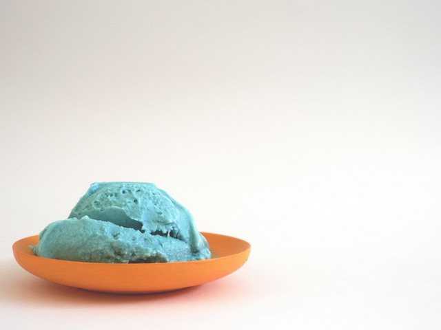
| i feel that the colours could be stronger and more saturated. looks a bit washed out though the idea is interesting |
|
|
|
05/02/2006 08:13:09 PM |
|
|
|
05/02/2006 02:20:17 AM |
| lol umm... a lot of empty space... interesting tho... |
|
|
|
04/30/2006 11:23:18 AM |
| negative space doesnt add to the photo. fits the challenge tho. |
|
|
|
04/29/2006 11:05:25 PM |
| Good color, not sure the ice cream photographed very attractively though. Photographing food is quite a challenge! |
|
|
|
04/29/2006 01:43:39 PM |
| Cool image..nice and simple |
|
|
|
04/29/2006 12:16:57 PM |
| I love this ... it is simple i like simple... 8 |
|
|
|
04/29/2006 09:43:15 AM |
|
|
|
04/29/2006 08:37:43 AM |
| not sure i'd want to eat this! |
|
|
|
04/29/2006 03:14:30 AM |
| Simple and stark. The colors could have been saturated a bit more to make this pop! |
|
|
|
04/27/2006 11:32:46 AM |
|
|
|
04/27/2006 10:22:15 AM |
|
|
|
04/27/2006 09:26:53 AM |
| Nice use of negative space. I'd really work on the saturation and adjust the contrast for more pow. The colors are rather flat. Also, I'd take the white and do selective color adjustment to remove the black. It's an easy fix and might make the image appear more "clean." |
|
 Photographer found comment helpful. Photographer found comment helpful. |
|
|
04/26/2006 11:24:25 PM |
|
|
|
04/26/2006 03:59:58 PM |
| Entirely too much wasted space in this image, IMHO. |
|
|
|
04/26/2006 07:42:17 AM |
| 4 - Like the concept. Looks like it needs a boost of contrast and color tweaking, also wonder if perhaps a little too much empty space compositionally, especially at the top, although not sure. Like to see more texture/definition in the ice cream, unless it doesn't look appealing to do so. |
|
| Photographer found comment helpful. |
|
|
04/26/2006 04:54:10 AM |
| just a little soft and grainy...perhaps a little flat. maybe some sdjustments would have made these great colours pop |
|
| Photographer found comment helpful. |
|
|
04/26/2006 12:50:34 AM |
| !!!!!!!!!!!!!!!!!!!!!!BLUE MOON ICE CREAM IS THE BEST!!!! I haven't seen it in years! Can you send me some? |
|
Home -
Challenges -
Community -
League -
Photos -
Cameras -
Lenses -
Learn -
Help -
Terms of Use -
Privacy -
Top ^
DPChallenge, and website content and design, Copyright © 2001-2025 Challenging Technologies, LLC.
All digital photo copyrights belong to the photographers and may not be used without permission.
Current Server Time: 03/12/2025 02:54:32 PM EDT.