| Author | Thread |
Comments Made During the Challenge  |
|
|
05/01/2006 07:57:39 PM |
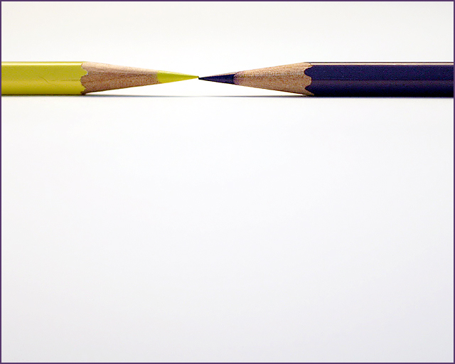
| I like your composition, the purple looks more like blue though... |
|
 Photographer found comment helpful. Photographer found comment helpful. |
|
|
05/01/2006 12:20:01 PM |
| Interesting take on the challenge but entirely too much wasted space, need to be cropped. |
|
| Photographer found comment helpful. |
|
|
04/30/2006 11:31:17 PM |
| very nice, but the points don't meet evenly |
|
| Photographer found comment helpful. |
|
|
04/30/2006 09:16:49 PM |
|
| Photographer found comment helpful. |
|
|
04/30/2006 07:16:50 PM |
| Ooh, you just missed with the pencils. If the edges were just touching and perfectly symmetrical, which I know is hard to do, but not impossible, it would have gotten probably a ten. |
|
| Photographer found comment helpful. |
|
|
04/30/2006 05:46:40 PM |
| Nice light-- interesting angle-- nice job |
|
| Photographer found comment helpful. |
|
|
04/30/2006 03:33:19 PM |
| I wish the purple was a little more saturated but the composition is nice and the space works well for this shot |
|
| Photographer found comment helpful. |
|
|
04/30/2006 01:20:08 PM |
| almost perfect - very minor thing to match the tip of the pencils excatly would have made it perfect :) |
|
| Photographer found comment helpful. |
|
|
04/30/2006 11:46:56 AM |
| I like this actually. Simple and lots of blank space, which really works for this pitcure. I think it could have been better with a brighter blue pencil, but it still is cool. |
|
| Photographer found comment helpful. |
|
|
04/30/2006 08:38:52 AM |
too much deadspace that serves no purpose whatso ever.
uninteresting photo but fits the challenge. |
|
|
|
04/30/2006 07:11:38 AM |
|
| Photographer found comment helpful. |
|
|
04/30/2006 06:05:17 AM |
| focus is spot on and I really like the use of negative space. My only wish is that the pencils were a bit brighter/vidid. Nice idea well executed |
|
| Photographer found comment helpful. |
|
|
04/30/2006 02:37:08 AM |
| interesting shot, good use of negative space |
|
| Photographer found comment helpful. |
|
|
04/29/2006 11:19:17 PM |
| wow the white really makes this image pop, great photo |
|
| Photographer found comment helpful. |
|
|
04/29/2006 08:30:32 PM |
| nifty idea ... kinda would like to see more. |
|
| Photographer found comment helpful. |
|
|
04/29/2006 01:02:55 PM |
|
| Photographer found comment helpful. |
|
|
04/29/2006 11:25:48 AM |
| GREAT PHOTO I REALLY LIKE THE BLANK SPACE - 8 |
|
| Photographer found comment helpful. |
|
|
04/29/2006 04:14:09 AM |
| Minimal. Simply. Clean and nice. |
|
| Photographer found comment helpful. |
|
|
04/29/2006 03:22:00 AM |
| Oh too bad they didnt align. Still a great shot though ;) |
|
| Photographer found comment helpful. |
|
|
04/28/2006 02:22:44 PM |
| Minimalistic, and for that, the point of contact atracts all my attention. Because of that I can see the pencils are not aligned. |
|
| Photographer found comment helpful. |
|
|
04/27/2006 09:43:22 PM |
| why is there more of the blue one than the yellow one? |
|
| Photographer found comment helpful. |
|
|
04/27/2006 12:04:19 PM |
| very good,I like it. only 1 mm too high the yellow point. |
|
| Photographer found comment helpful. |
|
|
04/26/2006 11:15:43 PM |
|
| Photographer found comment helpful. |
|
|
04/26/2006 09:39:16 PM |
| Good idea. With something this simple, I think it's really important that those two tips actually line up. Like it otherwise. |
|
| Photographer found comment helpful. |
|
|
04/26/2006 07:08:38 PM |
| 5 - Fairly clean. Like to see the points dead on perhaps, more balance, not sure. |
|
| Photographer found comment helpful. |
|
|
04/26/2006 03:19:55 PM |
|
| Photographer found comment helpful. |
|
|
04/26/2006 01:04:12 PM |
| Very fine minimalism and well executed. |
|
| Photographer found comment helpful. |
|
|
04/26/2006 06:52:42 AM |
| it's nice and simple...part of me is distracted by the fact that the two points don't quite line up, and on a shot that is minimalist like this, they really need to be perfect...in my opinion anyway |
|
| Photographer found comment helpful. |
|
|
04/26/2006 06:18:16 AM |
| The yellow one is too high by a mm ! |
|
| Photographer found comment helpful. |
|
|
04/26/2006 02:41:50 AM |
| Nice idea. Too much dead space. The extra dark/light difference is a problem with pigments. |
|
| Photographer found comment helpful. |
Home -
Challenges -
Community -
League -
Photos -
Cameras -
Lenses -
Learn -
Help -
Terms of Use -
Privacy -
Top ^
DPChallenge, and website content and design, Copyright © 2001-2025 Challenging Technologies, LLC.
All digital photo copyrights belong to the photographers and may not be used without permission.
Current Server Time: 04/26/2025 08:47:43 PM EDT.