| Author | Thread |
|
|
05/18/2006 07:18:33 AM |
[[trading post]]
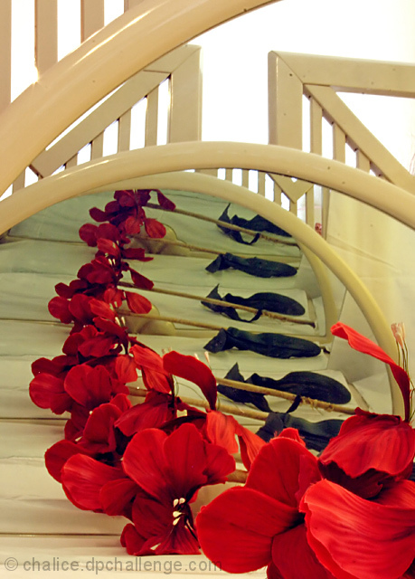
the flowers make a mice subject, but all that wood all over the image is way to distracting.
a closer crop at the top arch to make the image square would help alot.
lighting is good and it's a well thought of an executed, too bad about the bad crop. |
|
 Photographer found comment helpful. Photographer found comment helpful. |
|
|
05/14/2006 04:10:30 PM |
trading post
I'm not really sure what i'm looking at here... and this puts me off a little. I get that its mirrors, with a repeated reflection, but I still keep trying to figure out how the metal bars all fit in...lol I think it works compositionally, but I personally get distracted by trying to figure out what's what.
The rhythm of the repetition works well, but I get a kind of clinical feel from it, I think from the greens of the sheets, and the metal bars.
It is quite busy, I think it may work better with a lower angle, and cropping out the bars in the top half so that it is simpler, and the reflections recede further into the distance. |
|
| Photographer found comment helpful. |
|
|
05/12/2006 01:09:07 PM |
--Trading Post Comment--
Not a bad shot, just a little busy. I think this one would have scored much, much higher if the top of the frame had been cropped off. I am guessing that you left it so the viewer could understand what was in the frame. Quite honestly, I probably would have cropped it the same at first. I think that I would have tried to set up the shot so that none of the mirror frame or white wood were captured. I think that the sharpness and exposure are very nice. |
|
| Photographer found comment helpful. |
|
|
05/11/2006 08:45:41 AM |
Trading Post -
You have a good idea to start. This is the same idea as the slinky shot in this same challenge. I had a couple of issues withthis one. The colors were not as vibrant as they could have been. Same with the sharpness. I have never set up a shot like this, but more of a curve going into the mirrors would be nice. The slinky shot had a very nice curve going back. Also th eflowers just blend together toomuch as they go back and with such a vatiety o flines within the head of the flower the detail and separation just seem to get lost. I may hav ealso cropped the top off just above the second curve. The vertical lines above arent necessary and the blown out white doesnt seem to fit well IMO. |
|
| Photographer found comment helpful. |
|
|
05/10/2006 09:07:11 PM |
Trading Post comment
I gave this a 6 in voting. What made it work well for me is not just the rhythm/repetition of the flower, but the curve of the mirror and the lines/curves of whatever is behind it. Balance and composition of the picture are very good.
I'm a kind of monochromatic person so the blue/green in the reflection didn't suit me at first, but in looking at it again, it adds depth to the reflection. Should you want to remove it, you can by adjusting the color balance, increasing red, magenta and yellow (ie effectively decreasing blue, green, and cyan.) |
|
| Photographer found comment helpful. |
|
|
05/10/2006 09:15:08 AM |
Trading post...
Very cool shot! The colors are great as is the focus. The only fault I can find is the very bright white of the background with the blow out in the top left corner (my left when looking at it). I didn't vote this challenge but would have given it a 7. |
|
| Photographer found comment helpful. |
|
|
05/10/2006 08:33:41 AM |
[[Trading Post]]
OOOHH! My first thought was "wicked cool", tempered by some of the flaws in the railings in the background. There's also a color shift to green as I see the flowers go from front to back, and it confuses me. This is a great composition. The background might be a bit too pure white for the rest of the photo. |
|
| Photographer found comment helpful. |
Comments Made During the Challenge  |
|
|
05/09/2006 03:46:24 PM |
| what a shame the pieces of wood on the top. Very nice and smooth concept |
|
| Photographer found comment helpful. |
|
|
05/06/2006 05:42:33 PM |
| interesting shot - a bit of a greenish cast to it. Good lines. |
|
| Photographer found comment helpful. |
|
|
05/04/2006 10:25:26 PM |
| Nice composition. Interesting image. |
|
| Photographer found comment helpful. |
|
|
05/04/2006 08:03:10 PM |
| You have rhythm but all the lines and arches are very distracting. Colors don't meld very well for me either. - 5 |
|
| Photographer found comment helpful. |
|
|
05/04/2006 09:22:27 AM |
| Nice choice of color, layout and composition. I would have liked to see this without the purple flowers in it tho. |
|
| Photographer found comment helpful. |
|
|
05/04/2006 01:08:00 AM |
|
| Photographer found comment helpful. |
|
|
05/03/2006 09:39:51 PM |
| Cropping the top would really bring the focus to the flower |
|
| Photographer found comment helpful. |
|
|
05/03/2006 03:56:23 AM |
| nice shot .... could have cropped more to hide the top background... |
|
| Photographer found comment helpful. |
Home -
Challenges -
Community -
League -
Photos -
Cameras -
Lenses -
Learn -
Help -
Terms of Use -
Privacy -
Top ^
DPChallenge, and website content and design, Copyright © 2001-2025 Challenging Technologies, LLC.
All digital photo copyrights belong to the photographers and may not be used without permission.
Current Server Time: 03/12/2025 12:11:46 PM EDT.