| Author | Thread |
|
|
05/08/2006 09:48:08 PM |
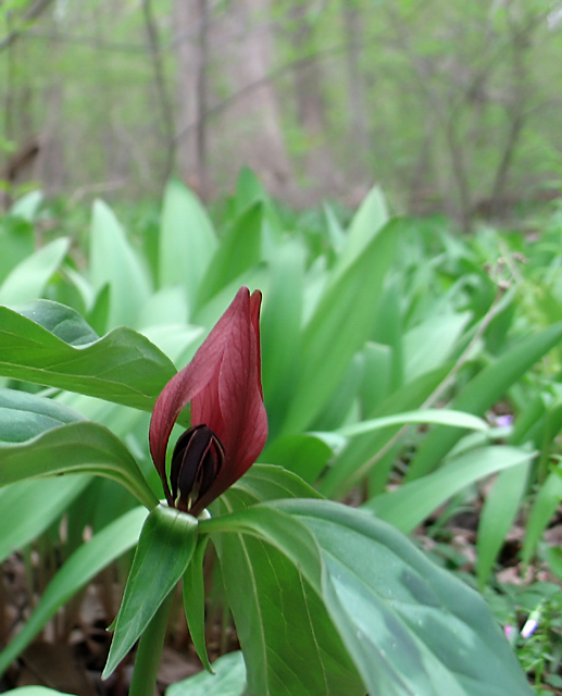
I was one of those 70 fives. I think the biggest thing I saw that could be fixed is a color cast. The shot appears to my eyes to be blue.
The composition is nicely off center. The distant background isn't that great and doesn't help the picture. It also appears to be quite slanted which may have been done on purpose to compose the flower, but it's another reason that background isn't helping. |
|
 Photographer found comment helpful. Photographer found comment helpful. |
Comments Made During the Challenge  |
|
|
05/07/2006 10:03:27 PM |
| I think a tighter crop would make this a stronger composition. |
|
| Photographer found comment helpful. |
|
|
05/07/2006 11:30:18 AM |
I really like this image. The subject is compelling. I love seeing the flower in its environment--it says a lot about the plant in a sort of botanical way. The composition nicely points to the subject and supports the information.
If I were to suggest ways to make this more of an "art" photo, I think you could eliminate much of the background information and focus more on the interesting blossom by cropping in much closer. The lighting is soft and realistic, to make it "pop" you could increase contrast and brighten the highlights some. sharpening a bit more would show off the veins in the red petals and pull them out from the background. All that said, I really like this image mostly as it is without DPC-ifying it. :) |
|
| Photographer found comment helpful. |
|
|
05/03/2006 03:42:37 PM |
| Nice drop of color in the gree...like the DoF |
|
| Photographer found comment helpful. |
|
|
05/02/2006 03:57:11 PM |
| I like this. Personally (IMHO) I think the photograph would have had a bit more punch if the top portion showing the trees/shrubs, as well as a third of the right hand side had been cropped out; leaving the red flowery part in the top right of the image. |
|
| Photographer found comment helpful. |
|
|
05/01/2006 11:43:15 PM |
| Very pleasant colors. Well done. |
|
| Photographer found comment helpful. |
|
|
05/01/2006 04:39:08 AM |
| welllaid out and good colour |
|
| Photographer found comment helpful. |
Home -
Challenges -
Community -
League -
Photos -
Cameras -
Lenses -
Learn -
Help -
Terms of Use -
Privacy -
Top ^
DPChallenge, and website content and design, Copyright © 2001-2025 Challenging Technologies, LLC.
All digital photo copyrights belong to the photographers and may not be used without permission.
Current Server Time: 03/12/2025 06:40:32 PM EDT.