| Author | Thread |
|
|
05/14/2006 11:36:45 PM |
From the CTP MkII
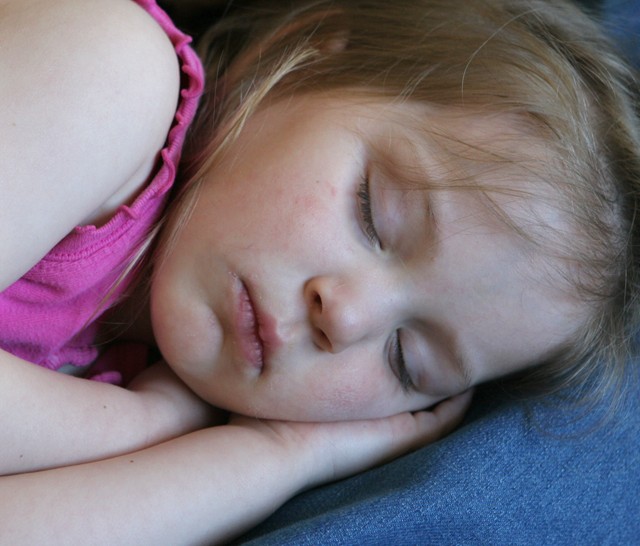
First Impression: A snapshot. Snapshots don't do well, IMO. Forgot to set the WB? It's a bit too blue for my tastes. 4... sorry.
Composition: Comp's okay, if not a bit too bland. If it's not a snapshot, it looks a lot like one. Crop's a bit too tight. 5.
Subject: Cute kid, nice face. I have nothing against kiddie shots, done properly. 6.
Technical: Lighting and white balance. This tanked your shot, a lot. Nothing a little PP won't fix, though. It's nice to see you pulled up to 620px.
|
|
 Photographer found comment helpful. Photographer found comment helpful. |
|
|
05/14/2006 12:30:17 AM |
Greetings from your own critique club.
First Impression
Very Cute.
Composition:
Very good composition.
Subject:
She is very cute. It does meet the challenge. The only reason this could have done bad is due to some voters doesn't score Flowers, kids/baby pictures, pets. This one should have done better than this IMO.
Technical (Colour and light):
The lighting is good. I always like the natural light. Little to blue for my taste, and too bright for the theme itself. The light on upper left corner is blown out.
Improvement:
Color adjustment, may be B&W or Duotone with low light??
Summary:
Nice picture over all and definately desereves better than what is got.
Cheers!! |
|
| Photographer found comment helpful. |
|
|
05/11/2006 11:10:46 AM |
From the CTP MkII
First Impression: it doesn't deserves so low score, IMO. Cute girl.
Composition: Maybe a bit too centered subject, needs some dynamism.
Subject: Nice idea and good cliche. You've selected a wonderful girl, but maybe a little "old" to be considered a baby.
Technical: I think the main problem with the score of this photo comes from the lightening. In interiors I think that is very difficult to lighten properly without the experience and equipment many DPCers have. I don't know how to explain it but lights doesn't look professional. And voters are very cruel with this... that's DPC.
Improvement: basically the light (see up^^).
Summary: Nice idea and subject but needs a bit more work on lightening.
�lex
|
|
| Photographer found comment helpful. |
|
|
05/11/2006 02:57:37 AM |
Hi!
I like this idea!
I would have cropped the pic a tiny bit closer to the head
The blue cast on her face makes it look a bit pale. (But you cant determine where shw's gonna fall asleep, so I'll forgive you;>)
I don't have much else to say really. Its a very good attempt:) Well done:) |
|
| Photographer found comment helpful. |
|
|
05/11/2006 12:06:05 AM |
Hi Margie!
I've got a couple things on this photo -
First, even though she's your baby and always will be, she's looking more like a toddler for the purposes of fitting into the "sleeping like a baby" cliche. It can be argued that "like" means she doesn't have to be, but photos that need to have a case made for them rarely do well. So it may be that a lot of voters didn't feel that the photo fully met its title - though there are a lot of high scoring photos that only met their titles halfway, so I was probably more strict on this issue than others.
As to the quality of the photo, well, I think the light is wrong. It's natural and I'm sure you didn't want to wake her up, but there's something cold and snapshottish about the blue tones. I would like to see this in a warmer, more golden tone. Also, the crop is too tight. Her head is cut off toward the top of the photo, and her hair at the right. So pull back a bit, warm up the light, and that will make a world of difference. :-) |
|
| Photographer found comment helpful. |
|
|
05/10/2006 09:52:16 PM |
Greetings from CTP2
First Impression:
Very cute.
Composition:
I might have zoomed out a bit just so not to cut off the top part of her head but otherwise is good.
Subject:
Works well for the challenge.
Technical (Colour and light):
Not really much to add that DrAchoo hasn't already covered.
Improvement:
What DrAchoo said. Also, I would add maybe choosing a different cliche next time. Not because this didn't fit the challenge but because you couldn't show off her eyes. Eyes can be so powerful in a shot even when the rest of the image has a bunch of flaws so I'd keep that in mind in the future.
Summary:
Good photo overall. I don't get those really low votes (1-3). That tells me there was a bias or they thought it didn't meet the challenge, which I don't get. Anyway, good luck in the future and I look forward to seeing more of your work.
|
|
| Photographer found comment helpful. |
|
|
05/10/2006 07:35:21 PM |
Comment from a member of your own commenting club :-)
First impression
1. Good Cliché
2. Beautiful girl
3. Lighting and colours are good.
What could you do better?
1. I am not sure on this but the focus is good but there is something blurred. Maybe sharpening a bit would do the trick.
2. There is something missing. Perhaps a small toy or something that hold your attention to the picture. My eyes tend to go away from the picture. Maybe just a solid frame would do the trick!
As you can see, I am not good in judging pictures like this one (if I am good in any).
Hope you forgive me on this.
P.S. I gave you a 6.
Message edited by author 2006-05-10 20:29:21. |
|
| Photographer found comment helpful. |
|
|
05/10/2006 01:41:16 PM |
Yes, baby pics do suffer some here, although they don't always. I gave this a 4 for pretty well one reason. The lighting. It looks very blue which never makes skin very pretty.
Pull up your photo in PS and adjust the color balance to +30/0/-30 (meaning more red and yellow). Now go back and forth to the before and after. You can see how she seems to come to life more.
If you used a flash on the picture it is the culprit for the color cast. The camera had a tough time setting the WB because there are no true grays in the picture.
Her shoulder is also blown out which makes the eye want to drift up there instead of her darling face. |
|
| Photographer found comment helpful. |
Comments Made During the Challenge  |
|
|
05/08/2006 01:26:34 PM |
| Cute but I think that the picture is a little too blue it makes her face look washed out. |
|
| Photographer found comment helpful. |
|
|
05/08/2006 12:47:59 PM |
| Nice job capturing a moment. IMO, more directional light (or maybe more accurately less uniform light) would make it a more "intimate" shot. |
|
| Photographer found comment helpful. |
|
|
05/07/2006 03:01:22 AM |
|
| Photographer found comment helpful. |
|
|
05/05/2006 02:26:54 PM |
|
| Photographer found comment helpful. |
Home -
Challenges -
Community -
League -
Photos -
Cameras -
Lenses -
Learn -
Help -
Terms of Use -
Privacy -
Top ^
DPChallenge, and website content and design, Copyright © 2001-2025 Challenging Technologies, LLC.
All digital photo copyrights belong to the photographers and may not be used without permission.
Current Server Time: 03/12/2025 08:53:24 AM EDT.