| Author | Thread |
|
|
06/30/2006 03:54:23 AM |
Never managed to vote all the shots in this challenge. But i am really surprised that this excellent shot did not place MUCH higher.
Robbed
Really nice shot which fits the challenge very well.
Best of luck in future challenges.
Kev |
|
Comments Made During the Challenge  |
|
|
05/07/2006 07:06:48 PM |
| Like the grain...good shot |
|
|
|
05/07/2006 09:23:36 AM |
| Nice shot, but not sure that I like the processing. |
|
|
|
05/06/2006 11:25:15 AM |
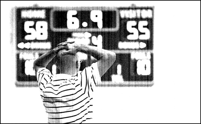
Hmmm, this one is tough for me to call. It looks very journalistic - even like you ripped it right out of the sports section.
But, it isn't that interesting or intriguing as a photo. Who is the guy, the coach, a fan, a suspended or injured player? I'm not sure what would make it better for me, something is needed to pump up the intrigue a little bit. |
|
 Photographer found comment helpful. Photographer found comment helpful. |
|
|
05/03/2006 03:31:23 PM |
|
|
|
05/03/2006 01:23:04 PM |
My fav in this challenge.
Maybe not so much photojournalistic, I dunno - I know nothing about photojournalism!, but it is a work of art. The vertical banding only adds to the image with its raw blownout-ness and poor definition on the scoreboard.
Lo-fi at it's best. |
|
|
|
05/03/2006 07:19:05 AM |
| cool high key photo, the effect was achieved with ... ? |
|
|
|
05/02/2006 05:16:37 AM |
| Is this some sort of style, it looks like a bad photocopy, sorry i don't get it |
|
|
|
05/02/2006 03:38:08 AM |
| The photo is too grainy for my liking and this appears to be post-production because it extends ove rthe arms of the person. |
|
|
|
05/02/2006 12:56:28 AM |
| well composed shot. It would be nicer if it didn't have the stripes through it. |
|
|
|
05/01/2006 11:45:56 PM |
| I don't know if many will like this pic, but I think the vertical lines, grain and B&W really add to the emotional impact of this photo. Great pose - his body language and the distant scoreboard tell the whole story. |
|
| Photographer found comment helpful. |
|
|
05/01/2006 11:40:02 PM |
| The processing is a real turn of for me. |
|
|
|
05/01/2006 09:39:01 PM |
| Too much processing for a headline photo. |
|
|
|
05/01/2006 09:12:14 PM |
| I normally don't like sport photos but I like this one. Nice work with this! |
|
| Photographer found comment helpful. |
|
|
05/01/2006 08:35:36 PM |
| a terrific shot ruined by a texture. I'm sure I won't be the only one to comment on it. Took your score from a 6 to a 4 for me. keep shooting these great shots, easy on the photoshop :) |
|
|
|
05/01/2006 04:17:20 PM |
| Why so grainy? This image does work for the human interest side of sports. |
|
|
|
05/01/2006 09:22:57 AM |
|
|
|
05/01/2006 04:32:09 AM |
| This is a good idea, and I know you were going for the 'newspaper' look, but the sheer amount of empty space in this picture isn't really what you'd find on a frontpage newspaper picture |
|
Home -
Challenges -
Community -
League -
Photos -
Cameras -
Lenses -
Learn -
Help -
Terms of Use -
Privacy -
Top ^
DPChallenge, and website content and design, Copyright © 2001-2025 Challenging Technologies, LLC.
All digital photo copyrights belong to the photographers and may not be used without permission.
Current Server Time: 04/26/2025 05:40:27 PM EDT.