| Author | Thread |
Comments Made During the Challenge  |
|
|
08/17/2003 07:37:46 PM |
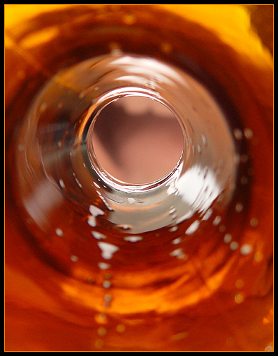
| Like the colours of the glass but the mouth looks too flat and duotoned. Good idea. [6] |
|
|
|
08/17/2003 03:54:16 AM |
| I hate it when I have to take my last sip, there's always room for one more :-) I like how you set your point of focus on the top of the glass. |
|
|
|
08/16/2003 10:42:37 PM |
| Would like to focus on the outside a little more |
|
|
|
08/15/2003 07:19:26 PM |
| LOL this is great. Can almost see his tonsils! good colors.. clever idea |
|
|
|
08/11/2003 07:47:04 PM |
| very well done, I would like to have seen a better focus on the teeth and tongue |
|
|
|
08/11/2003 03:22:46 PM |
| lol. The inclusion of the mouth is a hoot. Did you try drying out the bottle to remove what looks like bubbles. Still a classice image. Thanks for the chuckles. Jacko. 9 |
|
|
|
08/11/2003 09:20:39 AM |
| sometimes I just don't understand the message and this is one of those times |
|
Home -
Challenges -
Community -
League -
Photos -
Cameras -
Lenses -
Learn -
Help -
Terms of Use -
Privacy -
Top ^
DPChallenge, and website content and design, Copyright © 2001-2025 Challenging Technologies, LLC.
All digital photo copyrights belong to the photographers and may not be used without permission.
Current Server Time: 04/12/2025 01:33:55 PM EDT.