| Author | Thread |
|
|
05/14/2006 12:18:37 AM |
Greetings from your own critique club.
First Impression
Nice shot.
Composition:
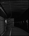
Composition is good. The flag the guy is holding up the face is very distracting and takes everything away for the picture and theme of rhythm.
Subject:
Not the best subject for this challenge.
Technical (Colour and light):
Good color, lighting and DOF. Building in the back is little bit blown out.
Improvement:
Better composition and timing. I think you did not shot this picture with the rhythm in mind. I would have avoided the building in the back and just took the people for the rhythm shot.
Summary:
Congratulations on your PB, I am sure you are on right track and this will not stay your Personal best for long.
Best of luck for the future challenges. |
|
 Photographer found comment helpful. Photographer found comment helpful. |
|
|
05/11/2006 07:21:02 AM |
Hi from CP2!
This is such a cool shot!!
The colous are great and the perspective is good!!
I would have liked to see more of the girls in focus though.
The guy's chest seems a bit grainy...
I love it:)
Well done on 52nd and a personal best:) |
|
| Photographer found comment helpful. |
|
|
05/10/2006 11:56:56 PM |
Hi OJ!
I actually scored this an 8 in voting. It's a really cool picture. Maybe the city in the background is a bit overexposed, but we can see everything that you really intended for us to see. Perhaps a bit of a noise issue, but that's really all. The rhythm here is both in the line and in the implied dance, which is a great double entendre for the challenge. :-) |
|
| Photographer found comment helpful. |
|
|
05/10/2006 11:48:28 PM |
Greetings from CTP2
First Impression:
Postive. I really like this.
Composition:
I wouldn't change anything. I love the depth the image has, which is carried out well with the composition.
Subject:
Interesting. It's one of those images where you look at it and want to look more.
Technical (Colour and light):
Nothing wrong here. The exposure works for me. The color is alive, which was how the event itself must have been like.
Improvement:
None really.
Summary:
Great photo. I like how you kept the grain in this shot.
Like always, it's just my opinion/suggestions. Good luck and I look forward to seeing more of your work! |
|
| Photographer found comment helpful. |
|
|
05/10/2006 07:20:46 PM |
Comment from a member of your own commenting club :-)
Congratulations on your highest score. This is quite good.
First impression
1. Good rithm
2. Bright and lovely colours
3. Good applying of rule of thirds and leading lines.
4. Contrast and focus good on main subject.
What could be better?
1. The houses are a bit to bright.
2. I would like to see a bit more of the others in focus. Probably not possible.
3. The person to the right looks a bit grainy. Maybe applying of NeatImage would have helped.
4. Try to care for the score - that helps make improvements :-)
Message edited by author 2006-05-10 20:28:59. |
|
| Photographer found comment helpful. |
|
|
05/10/2006 01:55:14 PM |
From the CTP MkII
First Impression: Seems you where not right... it has worked well. A very nice shot that captures the viewer.
Composition: Great. From right to left, from up and down to the center. It really creates a rhythm.
Subject: curious, very curios indeed. It makes the viewer ask about what are you looking at.
Technical: great focus and use of DOF. The colors are nice. The only flaw is the colour noise.
Improvement: The sky is a bit blowed. IMO it would have worked better without the buildings (I know, they were there, you couldn't help it...LOL). If the first man were looking at the camera this shot would have scored much better. The noise: it happens sometimes to me that set the camera to high levels of ISO and forget to correct them later.
Summary: a really wonderful shot with some small flaws. Good job.
�lex
|
|
| Photographer found comment helpful. |
Comments Made During the Challenge  |
|
|
05/08/2006 06:47:57 PM |
| its a lil noisy but still a good pic |
|
| Photographer found comment helpful. |
|
|
05/06/2006 03:53:47 AM |
| Good effort. I would have liked to see his face unobstructed...that might have given the viewer some idea as to what he doing with his hands ? |
|
| Photographer found comment helpful. |
|
|
05/04/2006 01:51:44 PM |
| Nice focus but a bit grainy. |
|
| Photographer found comment helpful. |
|
|
05/04/2006 01:02:15 AM |
|
| Photographer found comment helpful. |
|
|
05/03/2006 10:40:58 PM |
| Very good example of rhythm and a great photo. I really like the fade away of the buildings, fills space that could of been blown out sky and at the same time doesn't distract. Very nice! |
|
| Photographer found comment helpful. |
|
|
05/03/2006 09:33:56 PM |
| Border works REALLY well. Great shot. WEll done. |
|
| Photographer found comment helpful. |
|
|
05/03/2006 08:41:14 PM |
| Great photo. Where was this taken? |
|
| Photographer found comment helpful. |
|
|
05/03/2006 03:56:50 PM |
| A little more DOF would have been good here, but this is still a good photo. |
|
| Photographer found comment helpful. |
|
|
05/03/2006 04:20:47 AM |
| Lovely idea - needs full DOF though, as I see it... |
|
| Photographer found comment helpful. |
Home -
Challenges -
Community -
League -
Photos -
Cameras -
Lenses -
Learn -
Help -
Terms of Use -
Privacy -
Top ^
DPChallenge, and website content and design, Copyright © 2001-2025 Challenging Technologies, LLC.
All digital photo copyrights belong to the photographers and may not be used without permission.
Current Server Time: 03/11/2025 02:34:43 PM EDT.