| Author | Thread |
Comments Made During the Challenge  |
|
|
08/24/2003 10:40:36 PM |
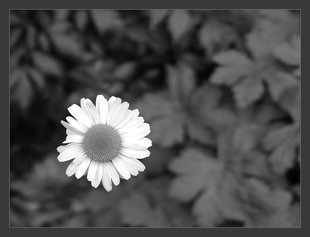
| great use of B&W. love the DOF and brightness of the flower. draws the eye right to it |
|
|
|
08/24/2003 09:27:14 PM |
| This is beautiful :) The contrast punch on this photo is just phenomenal and the soft background really enhances that quite a bit. I love a great black and white photo of a flower. Not many people ever explore this :) = 10 |
|
|
|
08/24/2003 09:24:29 PM |
|
|
|
08/24/2003 06:43:26 PM |
| Near perfection! This is a great b/w image. Nice tones throughout. 9 -danny |
|
|
|
08/23/2003 01:16:07 AM |
| Good use of depth of field to create a very subtle "blank" space. |
|
|
|
08/22/2003 10:37:23 PM |
| i think this is awesome! i would like to see a little more contrast in the flower, but i love the way it is separated out from the background. |
|
|
|
08/22/2003 12:29:33 PM |
| Pin sharp and good background. 10 |
|
|
|
08/22/2003 01:18:22 AM |
| Great use of black and white. The clarity is excellent and the design in the flower is beautiful to look at. |
|
|
|
08/20/2003 11:15:28 PM |
| I love your choice here to use B&W, and the border just adds the finishing touch to an already LOVELY picture!! Great job!! :) |
|
|
|
08/20/2003 06:58:44 PM |
Oh yes. Great use of DoF to create the negative space. Focus on the daisy is spot on.
Would love to see the colour version after the challenge, I have a feeling that I would like it even more, but that's down to personal taste.
I think a white border would suit the shot better than the grey, but pffft what does that matter.
'Only' a 9 because it leaves me wanting to see colour. |
|
|
|
08/20/2003 11:59:21 AM |
| Very good picture! Good choice to have it in B&W. - 8 |
|
|
|
08/20/2003 10:21:46 AM |
| The stark contrast between the flower and the background is what makes this work for me. I think that this works alot better than a black or single coloured background. Good use of DOF to create your negative space, it almost borders on 3D.... one of my faves this week. Good Luck, Todd. 9 |
|
|
|
08/20/2003 10:12:00 AM |
| Good use of negative space. I would have cropped it tighter so the daisy was right up to the edge in the lower left hand corner. |
|
|
|
08/19/2003 01:24:20 AM |
| Nice! Classic composition. Really like the black and white. Excellent border. |
|
|
|
08/18/2003 10:18:13 PM |
| Negative space should have a purpose. This crop has no 'reason' other than to fit the challenge. |
|
|
|
08/18/2003 03:10:23 PM |
|
|
|
08/18/2003 02:42:49 PM |
| Was the colour too distracting to leave in? |
|
|
|
08/18/2003 11:36:48 AM |
This is one flower photo I REALLY like. The DOF, use of thirds and lighting mixed with a great subject all makeup a great compositional photo. Good luck !
|
|
|
|
08/18/2003 11:20:59 AM |
| Gorgeous tones. THe white and sharpness of the flower creates the negative space behind. 10 |
|
|
|
08/18/2003 10:47:26 AM |
| I love the simplicity of this shot. Clean and b/w is a great choice. 10 |
|
|
|
08/18/2003 10:15:40 AM |
-
Message edited by author 2005-04-09 00:15:21. |
|
|
|
08/18/2003 04:18:20 AM |
| This pic is amazing, the B & W and the composition and the blurred background all together make for an excellent photo. I would have given this a 10 immediately except for two things. The border doesn't fit to the photo, it is distracting in a way and pulls my eyes from the beauty of your shot, this would have been far better without a border in my opinion. Also, (maybe I'm a little too picky now) the title is a bit unimaginative, but that isn't a big problem for me :-) (9) |
|
|
|
08/18/2003 12:35:00 AM |
| A very nice pic. One of my favorites. |
|
Home -
Challenges -
Community -
League -
Photos -
Cameras -
Lenses -
Learn -
Help -
Terms of Use -
Privacy -
Top ^
DPChallenge, and website content and design, Copyright © 2001-2025 Challenging Technologies, LLC.
All digital photo copyrights belong to the photographers and may not be used without permission.
Current Server Time: 03/12/2025 10:01:31 AM EDT.