| Author | Thread |
|
|
05/21/2006 02:36:36 PM |
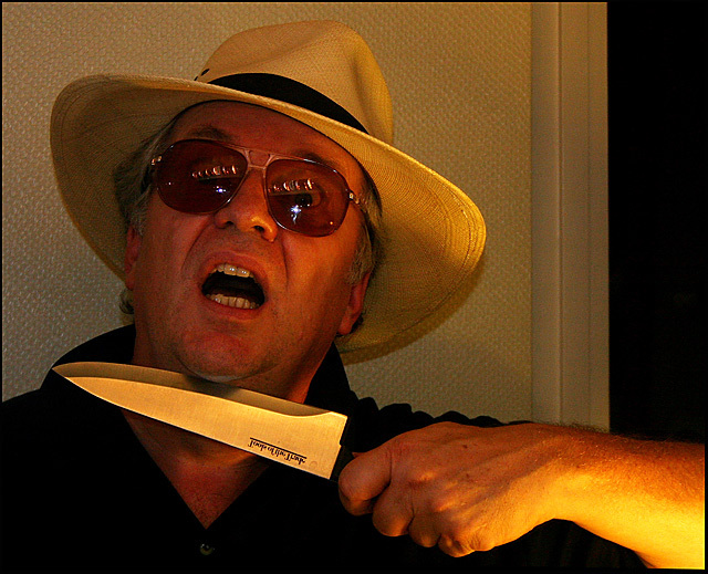
fwiw, I'm surprised at this score, would expect at least a 5.
Would look a lot neater with a plain black b/g, or even just burning in behind him, under advanced editing rules. There does seem to be a WB problem, has an orange tint. There's also the blown out bit on the arm thats distracting.
But its always hard to do selfportraits, and the result was a lot more cinema-relevant than a lot of the entries. |
|
 Photographer found comment helpful. Photographer found comment helpful. |
|
|
05/18/2006 07:21:53 AM |
[[trading post]]
this image could be better, the whitebalance is off, the image is too warm. to make an image like this work the knife must have it's real color, it has to be silver and shiny :)
and I don't like the reflection in the glasses, it's really distracting.
|
|
| Photographer found comment helpful. |
|
|
05/16/2006 11:23:33 PM |
hello again,
i first didnt really like the title. not that it is inherently wrong, just not for me.
i thought the white balance (whichc you may have intended) and the glare off the glasses made this lack any sort of appeal. this combined with me not liking the title....
i think the light on the arm is too harsh. i am unsure how to acheive the effect i think you wanted (kinda like that holding a flashlight to your face). i think you could have placed the light a bit more away from the forearm making that better. the glare on the glasses is gonna be bad from that lighting angle, so not sure what to do other than remove the lenses or eliminate them (but i agree they need to be there). the hat is a nice touch. maybe even one of them "hawaiin" shirts for color. |
|
| Photographer found comment helpful. |
|
|
05/15/2006 08:26:17 PM |
Trading Post comment
I thought this one quite humorous - gave it a 6. Angles and lines are good in the composition, and background is nice for the shot as it echoes the texture of the hat. The yellow light on the arm is a bit strong, and I'm not sure I like the yellow light overall, which makes the face a bit too red. If the reflections weren't on the glasses, you'd better be able to see the eyes wide open in "terror". Overall a pretty good shot, and definitely scored too low. |
|
| Photographer found comment helpful. |
|
|
05/15/2006 01:28:20 PM |
Trading Post -
First off - if you had lost the glasses and we couldhave seen your eyes your score would have been higher IMO. It looks as though you have them bugging out great but they are hidden by the shades and the bad reflection in them. A different background would have helped as well. One solid piece without the division and stepping away from it a bit would have been nice. THere is also an odd yellow color cast. Maybe the lighting that you used. I give you kudos on the shot ingeneral as self portraits can be challenging. You got pretty good focus on your face. As a movie poster shot - I am on the fence on that one. |
|
| Photographer found comment helpful. |
|
|
05/15/2006 08:13:05 AM |
Trading post...
I thought this was a good poster. During voting I gave you a 6. The only thing I could think of to make this better is to lose the glasses as the reflections are distracting. The composition is great and I really love the hat. |
|
| Photographer found comment helpful. |
|
|
05/15/2006 12:42:31 AM |
--Trading Post--
I don't get it. This is definitely not a sub-5 photograph. Great lighting, nice composition and excellent focus. The title works nicely with the capture, as well. My only critique would be to shift over to the viewer's left more. The door jamb is a little distracting. Nice work despite the score. |
|
| Photographer found comment helpful. |
Comments Made During the Challenge  |
|
|
05/12/2006 02:43:31 AM |
| well lit, photographed and the title makes sense |
|
| Photographer found comment helpful. |
|
|
05/10/2006 12:48:33 PM |
| a black indie comedy about a Dad who thinks it's hilarious to act out his own son killing him. When he's found dead in the jacuzzi, is it suicide or patricide? Will that damn auteur director ever tell us? Okay, good poster. |
|
| Photographer found comment helpful. |
|
|
05/09/2006 09:25:54 AM |
| too much red and yellow, the compo is bad ... i dont like it because of this :-) |
|
| Photographer found comment helpful. |
|
|
05/09/2006 06:16:23 AM |
| Aaargh, don't kill me! Lol. Funny shot. I think it would look better if you used a different background. |
|
| Photographer found comment helpful. |
|
|
05/09/2006 03:09:03 AM |
| Don't move an inch...nice shot |
|
| Photographer found comment helpful. |
|
|
05/09/2006 01:46:26 AM |
| nice idea, colour a bit too orange and the background lets it down big time, nice panama though. Shot would have been cool with someone in a ski mask refelcting in the sunglasses (you'd have had to change the title:-) |
|
| Photographer found comment helpful. |
|
|
05/08/2006 06:21:53 PM |
| The composition is pretty good on this. The glasses are a bit rough on this with all those reflections, and they also hide the eyes that could of really added to this photo. |
|
| Photographer found comment helpful. |
|
|
05/08/2006 05:32:12 PM |
| scary! If you had turned the lights opposite you down, or taken the photo with the lights to one side, you might have eliminated the distracting reflections in the glasses and created a bit more dramatic lighting. Your photo is also quite noisy - have you experimented with noise reduction software? |
|
| Photographer found comment helpful. |
|
|
05/08/2006 02:13:15 PM |
|
|
|
05/08/2006 12:15:34 PM |
| Fun shot. It's not gonna affect my score, but the title is confusing, as "patricide" is the killing of one's own father, and this looks like he's killing himself... |
|
| Photographer found comment helpful. |
|
|
05/08/2006 02:21:45 AM |
| poor color cast and lighting |
|
Home -
Challenges -
Community -
League -
Photos -
Cameras -
Lenses -
Learn -
Help -
Terms of Use -
Privacy -
Top ^
DPChallenge, and website content and design, Copyright © 2001-2025 Challenging Technologies, LLC.
All digital photo copyrights belong to the photographers and may not be used without permission.
Current Server Time: 03/12/2025 10:04:56 AM EDT.