| Author | Thread |
Comments Made During the Challenge  |
|
|
05/13/2006 02:23:57 AM |
| very good Image and title well done 8 |
|
 Photographer found comment helpful. Photographer found comment helpful. |
|
|
05/12/2006 05:55:03 PM |
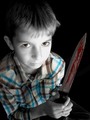
Not a bad movie poster. You even have the right orientation! You need a little more room somewhere though for the title and all the crap they have to put on a movie poster...
TC |
|
| Photographer found comment helpful. |
|
|
05/09/2006 06:10:48 AM |
| This one certainly creeps me out. Nice lighting. |
|
| Photographer found comment helpful. |
|
|
05/09/2006 05:03:58 AM |
| nice idea, but i think the execution could be better |
|
| Photographer found comment helpful. |
|
|
05/09/2006 02:49:58 AM |
| Pretty creepy...nice setup |
|
| Photographer found comment helpful. |
|
|
05/08/2006 05:18:38 PM |
| I thnk that this could be scarier with some different lighting - It needs a torchlight facing up from below! The blacks need to be closer to black, and the pool of light should pick out the subject, rather than giving a full frontal. Good backlightingm, though! |
|
| Photographer found comment helpful. |
|
|
05/08/2006 02:10:30 PM |
| Great subject for the challenge, but the choice of lighting doesn't emphasize scariness or creepiness. |
|
| Photographer found comment helpful. |
|
|
05/08/2006 01:05:25 PM |
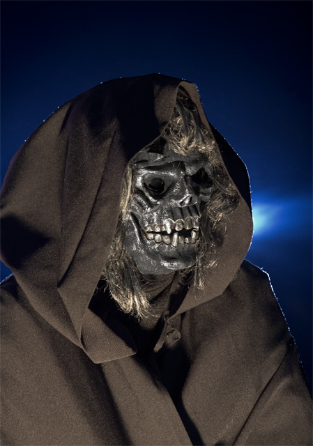
| I don't like the lint highlights, and the picture is too static. Shouldn't this prophet be doing or saying something? He looks too much like a guy in a rubber mask. |
|
| Photographer found comment helpful. |
|
|
05/08/2006 05:09:09 AM |
|
| Photographer found comment helpful. |
Home -
Challenges -
Community -
League -
Photos -
Cameras -
Lenses -
Learn -
Help -
Terms of Use -
Privacy -
Top ^
DPChallenge, and website content and design, Copyright © 2001-2025 Challenging Technologies, LLC.
All digital photo copyrights belong to the photographers and may not be used without permission.
Current Server Time: 03/12/2025 03:36:48 AM EDT.