| Author | Thread |
Comments Made During the Challenge  |
|
|
05/14/2006 11:47:11 PM |
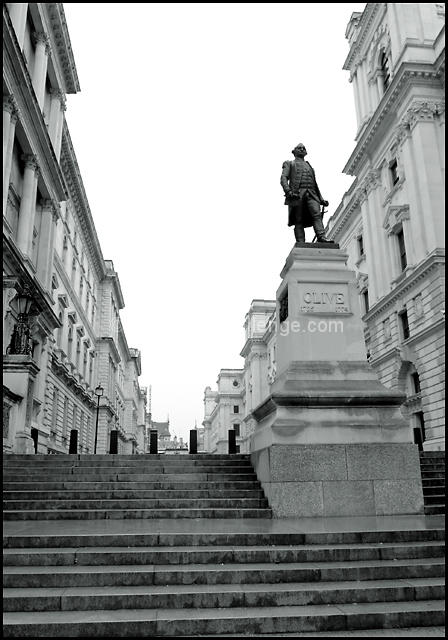
| Good title for a documentary. The blown-out sky does not do much for me, though. |
|
 Photographer found comment helpful. Photographer found comment helpful. |
|
|
05/12/2006 04:16:24 AM |
| Good title and the symetry of the compositionis interesting. It's just not very WOW or compelling. I don't know what will do it best, dramatic lighting/PP or a person in there to help tell the story of the movie. |
|
| Photographer found comment helpful. |
|
|
05/11/2006 03:55:53 PM |
| shame about the expanse of white featureless sky. slight angle of shot makes the steps look skewed too. |
|
| Photographer found comment helpful. |
|
|
05/10/2006 02:08:03 PM |
| Awesome title. I'd have straightened out the stairs at the bottom to parallel the frame, as long as that adjustment didn't mess with the statue position too much. |
|
| Photographer found comment helpful. |
|
|
05/10/2006 01:04:37 AM |
| Nice shot. The buildings tops give good depth of field. |
|
| Photographer found comment helpful. |
|
|
05/09/2006 06:18:49 AM |
| Nice point of view and good choice for black and white. Looks like it's tilted, but perhaps this was your intention. |
|
| Photographer found comment helpful. |
|
|
05/09/2006 02:54:00 AM |
|
| Photographer found comment helpful. |
|
|
05/09/2006 01:55:00 AM |
| not plumb and a little confusing, you haven't actually picked any one thing for the shot, Statue, steps or the building facia, nice idea though |
|
| Photographer found comment helpful. |
|
|
05/08/2006 04:20:32 PM |
| You bring up an interesting anomaly here: democracy is not supposed to be about power, yet you demonstrate with your photo a patently fascistic architecture purportedly designed to celebrate democracy. Unfortunately, the picture/title combo doesn't clue the viewer in that you are aware of this irony, which makes me hesitate to see the movie. What if it's just a boring movie about architecture, or passing a bill through the legislature? Good composition, though. Your strong diagonals add some energy. |
|
| Photographer found comment helpful. |
|
|
05/08/2006 02:17:22 PM |
| The image is a little flat-lighted, especially with this white sky, but it fits the title, which is quite strong. |
|
| Photographer found comment helpful. |
|
|
05/08/2006 01:02:21 PM |
| the image and title don't do much for me as a movie poster. the title could work with a different photo. the photo itself is ok. I would like a differnt sky, either blue or clouds. I think it should be tilted a little clockwise. |
|
| Photographer found comment helpful. |
|
|
05/08/2006 01:56:22 AM |
| I like the leading lines of the buildings |
|
| Photographer found comment helpful. |
Home -
Challenges -
Community -
League -
Photos -
Cameras -
Lenses -
Learn -
Help -
Terms of Use -
Privacy -
Top ^
DPChallenge, and website content and design, Copyright © 2001-2025 Challenging Technologies, LLC.
All digital photo copyrights belong to the photographers and may not be used without permission.
Current Server Time: 03/12/2025 03:52:04 AM EDT.