| Author | Thread |
|
|
05/19/2006 04:51:56 PM |
Greetings from the Critique Club...
Hi Laurie :)
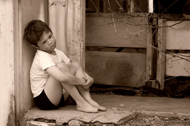
This photo scored rather well in the challenge and doesn't require much of a critique, but I have a possibly interesting point to offer you. Your choice of sepia toning on this photo may not have been the best option. Sepia toning achieves two effects, for the most part. 1 - it creates an antique feel and 2 - it creates warmth in the image. Neither of these two themes seem to be representative of your theme for this photo. Your photo represents something current, which wipes out the antiuqe nature of the sepia. Warmth and poverty aren't usually associated with each other either.
When you choose a post processing option, be sure to think about 'why' you are doing it. "It Looks Good" is often a valid enough reason, but determining "why" will help you grow :)
John Setzler
|
|
 Photographer found comment helpful. Photographer found comment helpful. |
|
|
05/15/2006 02:12:22 AM |
| VERY well done!!! I'm surprised this didn't score higher. It is a powerful, beautiful photo! Yes. .your little model deserves a blue ribbon in my book :) |
|
| Photographer found comment helpful. |
Comments Made During the Challenge  |
|
|
05/14/2006 06:21:49 PM |
| Oh what a charming portrait... I can imagine this image used to advertise a gritty film such as Angela's Ashes or the like - a film based on a story of a hard life. I like the pose and composition - with the negative space. The image overall feels a bit soft to me and the brightness of the sleeve area draws my focus away from his face. I am not keen on the distracting branches/ wires either. But overall I think the mood comes through well. |
|
| Photographer found comment helpful. |
|
|
05/14/2006 01:43:33 AM |
great capture! good photo.
I notice that the little boy's big toe is scratching. |
|
| Photographer found comment helpful. |
|
|
05/10/2006 09:00:07 PM |
|
| Photographer found comment helpful. |
|
|
05/10/2006 06:59:36 PM |
| nice job. I think the shirt should be dirtier for a poster showing poverty. I think I would have liked B&W better. |
|
| Photographer found comment helpful. |
|
|
05/10/2006 03:14:57 PM |
| Thought inducing. Very nice representation of hardship. |
|
| Photographer found comment helpful. |
|
|
05/10/2006 12:41:32 PM |
| He looks poor, but not desperate. Still, you're engaging the reader with a sympathetic character. So it's not a big draw, but it's a draw. And he's framed nicely, too. An overall good composition, with the option of putting text on the right. |
|
| Photographer found comment helpful. |
|
|
05/09/2006 06:25:52 PM |
| Great title, a nicely taken shot... but I just can't help feel that this is a staged shot. That is the only thing that bring it down for me. Good work all the same. |
|
| Photographer found comment helpful. |
|
|
05/09/2006 10:09:18 AM |
| Good title - like the tones used |
|
| Photographer found comment helpful. |
|
|
05/09/2006 06:07:38 AM |
| Really love the mood in this photo. Almost feel pity with the boy. Title fits well with the photo. Great colors. |
|
| Photographer found comment helpful. |
|
|
05/09/2006 03:13:55 AM |
|
| Photographer found comment helpful. |
|
|
05/08/2006 02:23:02 PM |
|
| Photographer found comment helpful. |
|
|
05/08/2006 02:00:26 AM |
| I really like this shot. The shirt seems a bit too clean though. Still - powerful and emotive. |
|
| Photographer found comment helpful. |
|
|
05/08/2006 01:13:38 AM |
| Interestin pose. But, dirty face and seemingly new t shirt loses the poverty credibility. Worth re shooting with different clothes. 6 |
|
| Photographer found comment helpful. |
Home -
Challenges -
Community -
League -
Photos -
Cameras -
Lenses -
Learn -
Help -
Terms of Use -
Privacy -
Top ^
DPChallenge, and website content and design, Copyright © 2001-2025 Challenging Technologies, LLC.
All digital photo copyrights belong to the photographers and may not be used without permission.
Current Server Time: 04/26/2025 02:53:31 PM EDT.