| Author | Thread |
Comments Made During the Challenge  |
|
|
05/16/2006 06:27:30 PM |
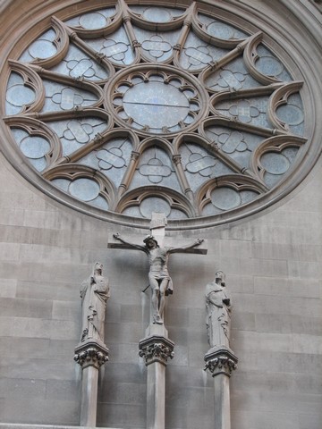
| good picture, just tilted at a weird angle. |
|
|
|
05/12/2006 01:51:17 PM |
| next time, move just a few feet to your right and watch your horizon... almost a good photo |
|
|
|
05/12/2006 12:23:32 PM |
| Not sure I like the composition. I would prefer if the round window were entirely in the frame and not cut off. The photo is nice and clear. |
|
|
|
05/11/2006 11:06:53 PM |
| Would score higher if it was squared. |
|
|
|
05/11/2006 03:14:06 PM |
| I like the composition and the simplicity of a mostly monochrome scene. I think there's a lost opportunity here - that window could add a contrasting glow if the light were right. |
|
|
|
05/11/2006 11:40:14 AM |
| the merger with the circle and the line at the bottom are destrating...you should have made the photo wider and cut a little off the bottom. |
|
|
|
05/11/2006 07:58:09 AM |
| would have liked to have seen more focus on the statues, looks more like a dream catcher but that is only my opinion |
|
|
|
05/10/2006 08:40:43 PM |
| i would of like to see more of the rose window. |
|
|
|
05/10/2006 08:17:12 PM |
| It looks like you want to achieve a "centered and straight" look, however the bottom left corner is odd in the picture. |
|
Home -
Challenges -
Community -
League -
Photos -
Cameras -
Lenses -
Learn -
Help -
Terms of Use -
Privacy -
Top ^
DPChallenge, and website content and design, Copyright © 2001-2025 Challenging Technologies, LLC.
All digital photo copyrights belong to the photographers and may not be used without permission.
Current Server Time: 03/17/2025 09:43:56 PM EDT.