| Author | Thread |
|
|
05/20/2006 01:37:56 PM |
(¯`·._.·[Critique Club]·._.·´¯)
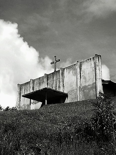
This is a nice photograph, and the compositional elements are good enough to take it a long way. The lighting is perfect with the shadows under the platform and the contrast between a blue sky and a white cloud. I think the main problem that people picked up on was the camera settings and post-processing. If you had included your aperture, iso and shutter speed I could probably have given more precise recommendations but it looks like a longer shutter speed would have worked better to reduce noise.
Your choice to convert to black and white (along with a lot of your other competition entries) seems to have worked well and has brought out some of the features of the crucifix and wall. Unfortunately what lost some of the details was the graininess that we see throughout the image. This could be caused by using your camera incorrectly or, more likely, because you may have over sharpened the image a little too much. I think there is still a short tutorial on DPC that went over this that I found really helpful, so you may want to give it a try.
Your use of putting the subject of the photograph right in the centre has worked very effectively to express the impact of the cross on whoever comes across the image. This has also led to a good even mix of sky and grass, which also lets the image flow nicely, and improves the richness of expressions, as though the viewer is really there.
Overall, this is a good photo although the technical elements need to be tweaked a little to improve the finished image.
Good Luck for all Future Competitions!
.·´¯`·->Lucien<-·´¯`·.
|
|
|
|
05/20/2006 01:36:58 PM |
(¯`·._.·[Critique Club]·._.·´¯)
This is a nice photograph, and the compositional elements are good enough to take it a long way. The lighting is perfect with the shadows under the platform and the contrast between a blue sky and a white cloud. I think the main problem that people picked up on was the camera settings and post-processing. If you had included your aperture, iso and shutter speed I cuold probably have given more precise recomendations but it looks like a longer shutter speed would have worked better to reduce noise.
Your choice to convert to black and white (along with a lot of your other competition entries) seems to have worked well and has brought out some of the features of the crucifix and wall. Unfortunatley what lost some of the deatails was the graininess that we see throughout the image. This could be caused by using your camera incorrectly or, more likely, because you may have oversharpened the image a little too much. I think there is still a short tutorial on DPC that went over this that I found really helpful, so you may want to give it a try.
Your use of putting the subject of the photograph right in the centre has worked very effectivley to express the impact of the cross on whoever comes accross the image. This has also led to a good even mix of sky and grass which also lets the image flow nicely and improves the richness of expressions, as though the viewer is really there.
Overall, this is a good photo although the technical elements need to be tweaked a little to improve the finished image.
Good Luck for all Future Competitions!
.·´¯`·->Lucien<-·´¯`·. |
|
Comments Made During the Challenge  |
|
|
05/16/2006 06:20:36 PM |
| I like the composition and the angle you chose to shoot from - good use of the clouds, too. A bit grainy and perhaps oversharpened in the foreround. |
|
|
|
05/16/2006 11:39:02 AM |
| looks like faith is all that is holding it up. nice shot. |
|
|
|
05/15/2006 02:48:44 PM |
| Way over sharpened. Concider recropping to improve the comp. |
|
|
|
05/14/2006 09:13:29 AM |
| I love the composition. I even dig it high key; perhaps it could be more selective though, there is some quality loss to the sky; nice image though. |
|
|
|
05/12/2006 03:02:12 AM |
| I think this is looking for connotations of Karma Bum road philosophy. The on-its-own Spartan profile might have benefitted from more sky and less foreground. It comes over as 'almost but not quite' to me. I like its attitude :) |
|
|
|
05/11/2006 09:17:00 AM |
| Nice composition, way too much grain and noise in the photo though. |
|
|
|
05/11/2006 08:50:43 AM |
|
|
|
05/10/2006 10:20:20 PM |
| Good composition, but waaay too much sharpening |
|
|
|
05/10/2006 07:33:25 PM |
| sort of bland. But does capture a lonely feeling. |
|
|
|
05/10/2006 04:14:31 PM |
|
|
|
05/10/2006 02:30:26 PM |
| Interesting, but too noisy for me |
|
|
|
05/10/2006 10:35:29 AM |
|
Home -
Challenges -
Community -
League -
Photos -
Cameras -
Lenses -
Learn -
Help -
Terms of Use -
Privacy -
Top ^
DPChallenge, and website content and design, Copyright © 2001-2025 Challenging Technologies, LLC.
All digital photo copyrights belong to the photographers and may not be used without permission.
Current Server Time: 04/01/2025 08:10:39 PM EDT.