| Author | Thread |
|
|
05/23/2006 02:58:37 AM |
Hey there from the Critique Club
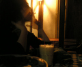
First off, always try to include some info about the shot in the Photographer's Comments section. It really helps out when we know what the photographer was thinking and what equipment/lighting/etc. were used, especially when you request a critique.
Camera Work/Technical: This one is tough to critique fairly because nothing seems to be in focus. If that was the intent of the capture, including that info in the comments section would be helpful for the critique. I will add that I really like the WB that you chose. You captured a photograph that projects a really great mood.
Lighting: I think it's nicely lit, but I would have liked to have seen the exposure just a bit longer. This would have included more detail.
Composition/Content: Very well done. I like the way you composed this one so that the frame is split between the dark and the light.
My Opinion: Great idea, just not fully executed. With better focus and a bit more detail, this one would have scored a great deal higher.
|
|
 Photographer found comment helpful. Photographer found comment helpful. |
Comments Made During the Challenge  |
|
|
05/16/2006 05:44:44 PM |
|
|
|
05/16/2006 07:59:53 AM |
|
|
|
05/11/2006 01:48:47 PM |
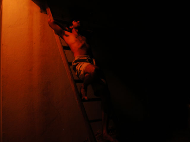
| Sorry but I find this too dark to rate fairly. |
|
|
|
05/11/2006 08:57:56 AM |
| I can't see the close relation to DaVinci Code, although it is a very interesting idea and nice composition. I wish there was more detail. I bumped it a bit for the artistic feel. |
|
|
|
05/11/2006 02:49:43 AM |
| Not enough sharpness. The subject is really hard to see. - 4 |
|
| Photographer found comment helpful. |
|
|
05/10/2006 09:07:18 AM |
| A good idea but could have been executed a little better. It seems to soft and maybe a little too dark. Having half of it dark and half light is a good idea though. 6 |
|
| Photographer found comment helpful. |
|
|
05/10/2006 06:42:39 AM |
| Sorry, can't see much in this pic... |
|
|
|
05/10/2006 01:11:11 AM |
|
Home -
Challenges -
Community -
League -
Photos -
Cameras -
Lenses -
Learn -
Help -
Terms of Use -
Privacy -
Top ^
DPChallenge, and website content and design, Copyright © 2001-2025 Challenging Technologies, LLC.
All digital photo copyrights belong to the photographers and may not be used without permission.
Current Server Time: 03/12/2025 09:52:45 AM EDT.