| Author | Thread |
|
|
05/22/2006 03:46:33 AM |
| Good job breaking your high score. |
|
 Photographer found comment helpful. Photographer found comment helpful. |
Comments Made During the Challenge  |
|
|
05/16/2006 06:48:07 AM |
| Good photograph, shame the building to the right is blurred, kinda ruins the overall effect. 6 |
|
| Photographer found comment helpful. |
|
|
05/13/2006 07:39:25 PM |
| Nice graphic. Quite strong, actually. |
|
| Photographer found comment helpful. |
|
|
05/12/2006 09:58:05 AM |
| Nice clean shot but a little too literal for my taste. The upper right lacks interest. |
|
| Photographer found comment helpful. |
|
|
05/11/2006 02:21:20 AM |
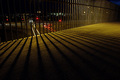
| Oh, so close to getting it all. Love the brightness, contrast color. Too bad you couldn't move the stuff in front. - 7 |
|
| Photographer found comment helpful. |
|
|
05/10/2006 09:23:42 PM |
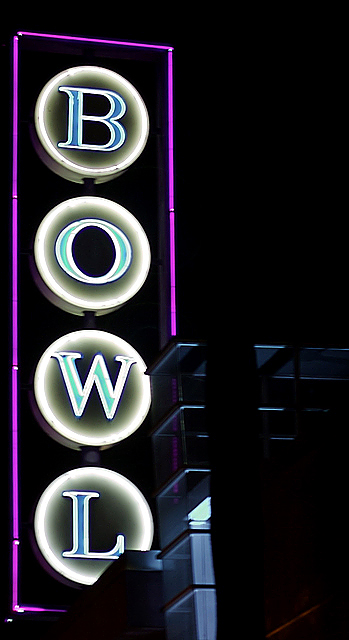
| Cool shot. It may not be a strike, but I think its a spare. Well composed, great colors and focus. Very ncie. |
|
| Photographer found comment helpful. |
|
|
05/10/2006 05:48:29 AM |
| Like the colout/texture of the foreground building too |
|
| Photographer found comment helpful. |
|
|
05/10/2006 04:50:25 AM |
| a bit too plain & simple but still a good image |
|
| Photographer found comment helpful. |
Home -
Challenges -
Community -
League -
Photos -
Cameras -
Lenses -
Learn -
Help -
Terms of Use -
Privacy -
Top ^
DPChallenge, and website content and design, Copyright © 2001-2025 Challenging Technologies, LLC.
All digital photo copyrights belong to the photographers and may not be used without permission.
Current Server Time: 03/12/2025 02:14:18 AM EDT.