| Author | Thread |
|
|
05/31/2006 05:11:03 PM |
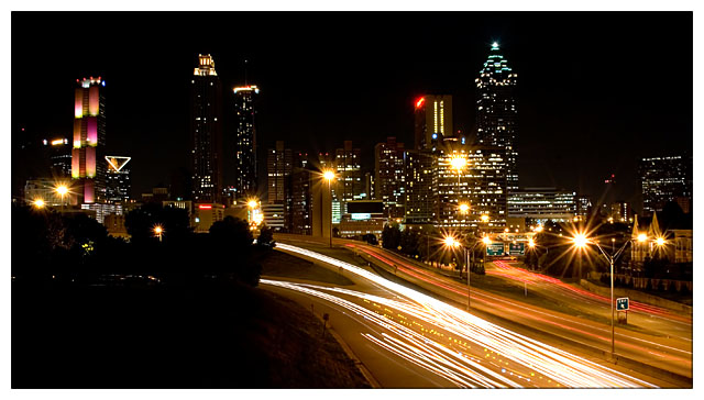
| Nice colors, nice starburst. It's a little distracting how the path of the cars just ends in the middle of the picture. It has a good balanced feel though, but the colors do need a touch more pop - IMHO. |
|
 Photographer found comment helpful. Photographer found comment helpful. |
|
|
05/25/2006 11:26:34 PM |
hello again,
i apologize for the delay on this one.
for me, i dont like the gallons of lights and the lack of detail in the buildings.
having said that, the road is great. the crop is nice. i do think that ifn you were to not have the sky so empty and some detail in the trees and buildings you would have scored even better with this one. |
|
| Photographer found comment helpful. |
|
|
05/21/2006 07:16:39 PM |
Hello from the Critique Club!
Well it looks like you have received a lot of good feedback already. I agree with the comments regarding the lower left corner. Maybe a slightly different camera position would have helped with that. I very much like what appears to be turn signals in the middle of the oncoming traffic. I haven't seen that before in a shot like this.
Well done.
-Bill |
|
| Photographer found comment helpful. |
|
|
05/21/2006 03:39:44 PM |
Sorry to get to it so late - I started a comment a few days back but never finished it.
This is a very crisp, strong cityscape. The car trails work well as a leading line, and the small aperture has worked wonders with the lights!
The area of darkness in the bottom left makes the composition a little unbalanced (but I didn't really notice it til the second time I looked at it). Conversely, the brighter area of streetlights on the right hand side works well as a compositional element right on the third. |
|
| Photographer found comment helpful. |
|
|
05/20/2006 07:12:47 PM |
Tradingh post -
Look slike if I hadnt given you that 7 I would have beaten you by a bit. We have a nice little thing going seeing each other on the same page. Very nice shot. Dont really know what I would do to this to make it better. Maybe just a tad higher saturation to make the colors a bit more vibrant - but thats a big maybe. You have a great shot here and it makes me want to go out and see if I could capture something like this. Well done. |
|
| Photographer found comment helpful. |
|
|
05/18/2006 07:59:35 AM |
[[trading post]]
very nice cityscape, good composition, nice colors and overall a good image, the only really distracting thing is that red light on top of one of the buildings.
|
|
| Photographer found comment helpful. |
|
|
05/18/2006 05:05:37 AM |
| I thought this picture was done well. I like the range of tones from white lights to pitch black sky and left foreground. I like the inclusion of the foreground because it balances the skyline and helps add depth to the photo. The leading lines of the road way draw my eye into the heart of the picture. The star-burst street lights are an added plus. |
|
| Photographer found comment helpful. |
|
|
05/17/2006 07:41:03 PM |
Trading Post comment
I gave this an 8, Eric. I really like night shots like this and will eventually get some of my own. The vantage point you chose is perfect for this kind of shot - nice balance in the buildings on the skyline, both in height and lighting. I like the way the road curves and disappears into the trees. Color and sharpness are good as well.
(Interesting reading comments after I've written mine. I actually like the dark section in the lower left quite a bit.) |
|
| Photographer found comment helpful. |
|
|
05/17/2006 05:47:13 PM |
Trading post...
Nice long exposure. I like the colors and the starbursts on the streetlights. The light trails are excellent too. I dislike the large dark spot on the bottom where it looks like it might be trees or bushes. Maybe a slightly different angle to eliminate that would have put you so much higher. |
|
| Photographer found comment helpful. |
Comments Made During the Challenge  |
|
|
05/16/2006 10:23:47 AM |
| Oooh, lots to look at but in a good way. Shame there's no real variation in light colour... it all kinda merges together. |
|
| Photographer found comment helpful. |
|
|
05/12/2006 08:30:05 PM |
| Great capture, but I feel that the darkness in the bottom left throws the picture off balance. |
|
| Photographer found comment helpful. |
|
|
05/12/2006 05:18:14 PM |
|
| Photographer found comment helpful. |
|
|
05/11/2006 08:17:40 PM |
| great title, captures the mood of the photo perfectly! Well done ... |
|
| Photographer found comment helpful. |
|
|
05/10/2006 05:53:22 AM |
|
| Photographer found comment helpful. |
Home -
Challenges -
Community -
League -
Photos -
Cameras -
Lenses -
Learn -
Help -
Terms of Use -
Privacy -
Top ^
DPChallenge, and website content and design, Copyright © 2001-2025 Challenging Technologies, LLC.
All digital photo copyrights belong to the photographers and may not be used without permission.
Current Server Time: 04/22/2025 12:42:22 PM EDT.