| Author | Thread |
Comments Made During the Challenge  |
|
|
05/15/2006 01:40:05 PM |
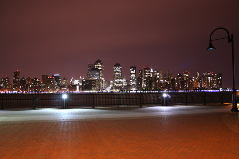
| I'm not sure that I like the horizon cutting across the center of the frame. although i like that you've encorperated a new dimension by adding the lamp post and the brick walkway I'm not sure it really makes this an interesting shot. |
|
|
|
05/14/2006 11:12:24 PM |
| Shaky, poorly-composed image. It looks as though it were hastily snapped off with a decent camera-phone. Also, the horizon is noticeably tilted, and that seriously hurts the picture. |
|
|
|
05/14/2006 03:08:46 PM |
| Don't cheat yourself on using less than the max 640 pixels allowed. Would like to see this bigger, would be able to see more detail in the brick, etc. |
|
|
|
05/14/2006 07:23:17 AM |
| very nice and sharp and clear , its a bit small in size isn't it? |
|
|
|
05/14/2006 01:52:08 AM |
| I would crop it down to make it more panoramic. |
|
|
|
05/12/2006 03:39:10 PM |
| too much uninteresting forground. |
|
|
|
05/12/2006 12:29:55 PM |
| too much brick in the forground. |
|
|
|
05/11/2006 08:04:26 PM |
| I'd prefer a bit less of the foreground and more of the city ... I really like the street lamp on the right ... nice picture |
|
|
|
05/11/2006 03:49:02 PM |
| you really should try and use the available size, and I think your score would go up. |
|
|
|
05/10/2006 08:23:59 PM |
| //www.dpchallenge.com/tutorial.php?TUTORIAL_ID=26 |
|
|
|
05/10/2006 05:23:58 PM |
|
|
|
05/10/2006 04:59:04 PM |
| Make it bigger next time. |
|
|
|
05/10/2006 03:45:28 PM |
| Too much walkway in the foreground for me, but I see you kind of had to position yourself that way to maintain your perspective, cover the wide angle, and keep the city line straight on the horizon. Tough situation. |
|
|
|
05/10/2006 01:49:00 PM |
| I would have shot this one from closer to the railing. The two lights on the bottom, and the streetlight are a bit distracting. |
|
|
|
05/10/2006 08:59:11 AM |
| Not a bad shot. Perhaps could have been bigger. I would personaly have shot over the fence and possibly gone for a panoramic shot. It's a good effort though. |
|
|
|
05/10/2006 05:58:11 AM |
| I feel that this is slightly on the wonk and should be rotated a degree or so clockwise. |
|
Home -
Challenges -
Community -
League -
Photos -
Cameras -
Lenses -
Learn -
Help -
Terms of Use -
Privacy -
Top ^
DPChallenge, and website content and design, Copyright © 2001-2025 Challenging Technologies, LLC.
All digital photo copyrights belong to the photographers and may not be used without permission.
Current Server Time: 03/12/2025 06:36:08 PM EDT.