| Author | Thread |
|
|
05/22/2006 09:38:21 PM |
Greetings from the Critique Club!
Technicals:
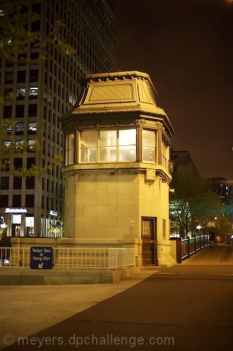
In terms of lighting and color it's very good. This is a very sharp looking image. In general this image captured night quite well.
Subject/composition:
When I first saw this I didn't think this was a bridge since the main focus is the building structure. This would have been a better image had you shot this landscape style with the structure to the left. That way you would have the main focal point off-center and also include more of the bridge in the shot for people to identify with.
Another thing is the size of the image. It's quite small. Images like that are always going to be at a disadvantage since detail is harder to see and appreciate.
Verdict/Summary:
Overall this image has a lot of quality to it. Probably the best I've seen for an image of this size in the challenges and definitely one that scored so low that met the challenge. So good job there. If the image was larger and composed a bit differently I think this would have scored much much higher. That's all I have. Good luck on your next challenge and I look forward to seeing more of your work! |
|
 Photographer found comment helpful. Photographer found comment helpful. |
|
|
05/17/2006 10:19:18 AM |
| Your picture is very sharp and the dull colors give it a late-night feel. When I worked in Chicago one summer I walked past this bridge many times and it was always busy with people. What probably doesn't work well here is how the tower is dead center. Perhaps moving a bit to the left and showing more street would have added, but I suspect there may have been cars there. |
|
| Photographer found comment helpful. |
Comments Made During the Challenge  |
|
|
05/16/2006 08:23:42 PM |
|
| Photographer found comment helpful. |
|
|
05/15/2006 11:47:58 AM |
| There is nothing wrong with this shot at all: it's technically well done, focus is good, good sharpness. It's a night shot so lighting is below average and colors are a bit muted. Compositionally, I'd say it's a little flat. The point-of-view is not exceptionally interesting, the main subject is very centered. If you really wanted to focus on the central building, why not move in even more and get rid of that negative space (pavement/street) at the bottom? Or move back and find a more interesting composition, perhaps decentering the subject and showing a bit more of the bridge, or a passer-by, or something to add a little drama and action to an otherwise static scene? |
|
| Photographer found comment helpful. |
|
|
05/14/2006 07:34:24 AM |
|
| Photographer found comment helpful. |
|
|
05/12/2006 03:13:58 AM |
| This photo could use more clarity, it doesnt have the pop I would expect against its geometric shape with such a dark backdrop. Maybe a slightly different angle would have given more to the photograph. Impossible to know all the conditions for the photographer and camera, but looks like a tricky lighting situation with a shadow overcast to contend with. Overall it is interesting and original. Nice work considering the many possible technical challenges in attempting a shot like this. |
|
| Photographer found comment helpful. |
|
|
05/10/2006 04:56:08 PM |
|
| Photographer found comment helpful. |
Home -
Challenges -
Community -
League -
Photos -
Cameras -
Lenses -
Learn -
Help -
Terms of Use -
Privacy -
Top ^
DPChallenge, and website content and design, Copyright © 2001-2025 Challenging Technologies, LLC.
All digital photo copyrights belong to the photographers and may not be used without permission.
Current Server Time: 03/12/2025 08:12:37 AM EDT.