| Author | Thread |
Comments Made During the Challenge  |
|
|
05/16/2006 09:09:56 PM |
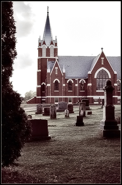
| Great post processing here. Love the surreal look. |
|
|
|
05/16/2006 06:13:58 PM |
| I like the overall look of the picture, but the bush on the left is a bit too strong. I do like the gravestone on the right framing the picture. |
|
|
|
05/13/2006 08:11:02 PM |
| No need for the tree on the left. Nice tone of color. |
|
|
|
05/11/2006 04:43:03 AM |
| This is a pretty good shot and fits the challenge well. I'm just concerned about the dark marks on the left side. They may be clouds, but with the rest of the sky looking blown out, they look more like smudges of some kind to me. A shame, because the overall composition is good. |
|
|
|
05/10/2006 11:01:43 PM |
| Tighter crop to remove the brushes on the left would have been much better. |
|
|
|
05/10/2006 03:30:51 PM |
| The tree on the left is very distracting; the sky is rather washed out. |
|
|
|
05/10/2006 10:41:53 AM |
| Interesting post processing, it works well to hide the over exposed sky. I like the composition, almost as if we are dead and looking out at the churchyard where we have been laid to rest. |
|
|
|
05/10/2006 08:30:37 AM |
| I like the decadent colors. |
|
|
|
05/10/2006 02:11:58 AM |
| Hey, I've been there! Never photographed it from this angle though. I like the near desaturation. Too bad you couldn't have had a few more clouds. |
|
|
|
05/10/2006 02:09:21 AM |
| i love the desaturation here |
|
Home -
Challenges -
Community -
League -
Photos -
Cameras -
Lenses -
Learn -
Help -
Terms of Use -
Privacy -
Top ^
DPChallenge, and website content and design, Copyright © 2001-2025 Challenging Technologies, LLC.
All digital photo copyrights belong to the photographers and may not be used without permission.
Current Server Time: 03/12/2025 12:54:48 PM EDT.