| Author | Thread |
|
|
08/25/2003 01:56:55 AM |
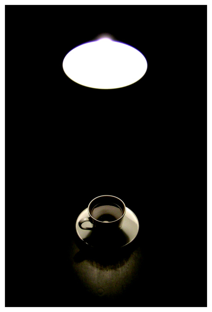
Thanks for the comments - yes, basically I agree that it would be better without the light, but the negative space wouldn't be such a strong element of it without the light. Without the glare from the light that would just be a white oval.
Wish I'd had time to re-shoot - I'd have lit the shade of the lamp a little too, just to give some definition. Ah well.
Ed |
|
Comments Made During the Challenge  |
|
|
08/24/2003 09:55:18 PM |
| I can't tell you what it is that I love about this photo. I think it's the pure simplicity of it for the most part. = 10 |
|
 Photographer found comment helpful. Photographer found comment helpful. |
|
|
08/24/2003 05:14:21 PM |
| I think I prefer it with just the coffee and without the light |
|
| Photographer found comment helpful. |
|
|
08/24/2003 05:14:02 PM |
| this is gorgeous. at first it struck me negatively, but really, i think this is great. |
|
| Photographer found comment helpful. |
|
|
08/24/2003 10:48:49 AM |
| I like the idea here, but I like the photo better when I scroll so that I can only see the coffee, not the light. The light doesn't seem to add much - and the difference in brightness between it and the cup and saucer is pretty marked. |
|
| Photographer found comment helpful. |
|
|
08/20/2003 10:44:50 PM |
| I like the balanced light areas with the surrounding blackness. The coffee cup is a little indistinct - I think seeing it in a larger format would help, but we just have 640. I like it. |
|
| Photographer found comment helpful. |
|
|
08/20/2003 01:15:45 PM |
| I like how the neg. space stands mostly between your two objects, adding a sense of mystery as well as some kind of 'connection' between them. Nice lighting. 9 |
|
| Photographer found comment helpful. |
|
|
08/19/2003 12:31:20 PM |
| Simple and effective. Good use of -ve space, your lighting works well here. 8 |
|
| Photographer found comment helpful. |
|
|
08/19/2003 08:20:06 AM |
| Good picture, the coffee cup comes out nicely and the table also, but i think the light is not defined enough, it just washes into one white blob. - 7 |
|
| Photographer found comment helpful. |
|
|
08/19/2003 02:57:19 AM |
| 9. Subtle. Elegant. Printable. Marketable. Excellent job. Interesting negative space. |
|
| Photographer found comment helpful. |
|
|
08/19/2003 01:09:40 AM |
| Oooh, like this idea. I really, really like the toning and shading on the coffee cup - so much in fact that I'd have seriously considered cropping just below the light. If cloning were allowed, I'd just nuke the light and keep the framing the way it is. As such, minimizing the chromatic aberration on the light by desaturating the blue and magenta channels would have been something I'd have considered. Still, excellent. |
|
| Photographer found comment helpful. |
|
|
08/18/2003 10:08:56 PM |
| Well balanced. Interesting picture and play on light. |
|
| Photographer found comment helpful. |
|
|
08/18/2003 12:44:54 PM |
| Wow, this really has an impact. I love it. It's almost abstract until the image becomes clear. Very very nice work! |
|
| Photographer found comment helpful. |
|
|
08/18/2003 06:09:02 AM |
| This is great! (not you Tarique, is it?). This is real top stuff. The only thing I can think of, is having that slight glare bump on top of the light circle (on the top) removed. I only say that, because the rest of it is made of of very clean, smooth, geometric shapes. The symmetry works well with this too. 9 |
|
| Photographer found comment helpful. |
|
|
08/18/2003 04:08:57 AM |
| I think I would've preferred seeing only the coffee, now the light steals too much attention. |
|
| Photographer found comment helpful. |
|
|
08/18/2003 12:39:43 AM |
| looks like pic taken with oly5050 10 from me ! |
|
| Photographer found comment helpful. |
|
|
08/18/2003 12:29:03 AM |
| i think it'd be better image without the light. 7 |
|
| Photographer found comment helpful. |
Home -
Challenges -
Community -
League -
Photos -
Cameras -
Lenses -
Learn -
Help -
Terms of Use -
Privacy -
Top ^
DPChallenge, and website content and design, Copyright © 2001-2025 Challenging Technologies, LLC.
All digital photo copyrights belong to the photographers and may not be used without permission.
Current Server Time: 03/12/2025 10:57:04 AM EDT.