| Author | Thread |
|
|
08/25/2003 10:40:52 AM |
| Nice work, Jason! I think it should be higher in placement, but oh well. keep up the good work! |
|
|
|
08/25/2003 06:02:47 AM |
|
Comments Made During the Challenge  |
|
|
08/24/2003 08:42:14 PM |
|
|
|
08/24/2003 06:01:16 PM |
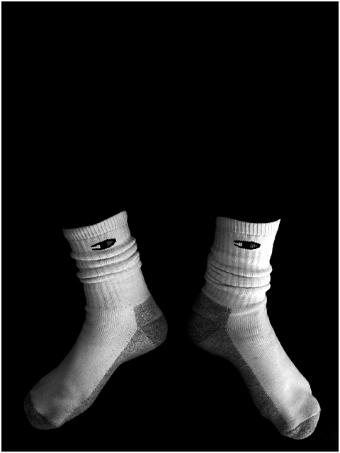
| Hey, I wear those same socks! Well, not THOSE socks specifically of course, but I buy this KIND of sock! so 10 points for you! Just kidding. Nice shot, nice lighting, neg space implies more body, but darkness adds mystery. Super work, but only 9. After looking at all my nines, I\'m changing this to a 10. Congratulations!--Wait. After looking at the other 10s, I decided to put this back to a 9. Wait again. It really does belong in the 10s. Sorry for all of my waffling. 10 |
|
|
|
08/24/2003 05:27:01 PM |
|
|
|
08/23/2003 12:39:24 AM |
|
|
|
08/23/2003 12:26:17 AM |
| Very creative! Looks like the socks are floating. |
|
|
|
08/20/2003 05:23:59 AM |
|
|
|
08/19/2003 10:34:12 PM |
| lol. That is so funny. Very creative. Jacko. 8 |
|
|
|
08/19/2003 06:07:37 PM |
|
|
|
08/19/2003 06:02:44 PM |
| I did not enter this challenge because I was unclea about negative space and what that meant. Your shot is however what I imagined it to be, more than any of the other shots. Very nice job. I even like your choice of sox, with how the "C" is placed. Lighting is great and idea is creative. |
|
|
|
08/19/2003 02:07:55 PM |
| You've done well at keeping everything very black. I keep looking in the "negative space," trying to find the person! 9. |
|
|
|
08/19/2003 01:12:53 PM |
| Like this shot but I feel there is more space than is needed to keep the effect. Less is more here. |
|
|
|
08/19/2003 11:38:53 AM |
| An amusing shot, effectively captured. Well done for making your nackground so uniformly black. Great lighting. I'd say that the 'wow' factor here is definitely in the -ve space. 8 |
|
|
|
08/18/2003 10:17:50 PM |
| Great idea. Very original. Love the contrast and the subject. |
|
|
|
08/18/2003 11:02:45 AM |
|
|
|
08/18/2003 10:12:12 AM |
-
Message edited by author 2005-04-09 00:16:43. |
|
|
|
08/18/2003 05:09:57 AM |
| Brilliant! A touch of color (like on the champion logo) would have made it an even bigger wow picture. |
|
|
|
08/18/2003 04:28:53 AM |
|
Home -
Challenges -
Community -
League -
Photos -
Cameras -
Lenses -
Learn -
Help -
Terms of Use -
Privacy -
Top ^
DPChallenge, and website content and design, Copyright © 2001-2025 Challenging Technologies, LLC.
All digital photo copyrights belong to the photographers and may not be used without permission.
Current Server Time: 03/12/2025 08:51:40 AM EDT.