| Author | Thread |
|
|
05/31/2006 02:34:54 AM |
Greetings from the Critique Club. My critiques are generally geared towards trying to help you improve your score within DPC, and not on any true "artistic" merit of the photograph itself, unless it relates to DPC voters and scoring. Please keep that in mind as you read this.
Initial Thoughts
Pretty good, I see great potential in this.
Composition/Content
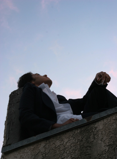
First off, I just want to say that in self-portraiture, many people get the wrong idea that you have to be engaged with, or looking into, the camera. You probably got hit a little bit for this, but it's not true, and I like the idea you have presented here, personally. However, I think choosing to shoot from so low an angle has also hurt, (especially with the distortion from the wide angle), and there may just not be enough *you* to really complete the photo.
Background
The sky is a little too light. Especially on DPC, people like strong, darker, deep blue skies. To achieve this end, most people either use a polarizer, or they use a gradient on their skies. This helps give the shot a lot more presence and keeps it from being too flat. A darker sky would also not cause the subject to look darker, and would help with the contrast issue, which could (especially on darker monitors), turn you into a silhouette.
Camera Work/Technical
Using such a small aperature for a photo of this nature isn't needed at all. You could have dropped to an f/5.6 or f/8 and given yourself a higher shutter speed. You'd have dropped the exposure on the sky, and still maintained good detail in yourself. Especially if you'd shot at less of a low angle. If you start to lose detail in the subject, a reflector can help that as well.
Digital Processing
As I said, a deeper sky would have helped bring this shot out. Also, there seems to be a general softness to the shot which doesn't really work here (makes it just seem more out of focus), and some work with USM would have helped a lot.
Fits the Challenge
Unless this isn't you, it fits the challenge. I do think, however, that many voters gave you lower marks for your choice of composition here, which is a little sad. While portraiture generally follows a certain set of "rules", this is a good choice for a departure.
My Opinion of the Photo
A good photo with a lot of potential. I'm not a fan of the low, low angle, but if you'd brought it up some, did the tweaks I mentioned, and gave yourself a *little* more presence, this could have really worked well. As it is, I still think it was under-appreciated, and probably deserving of a higher score. Keep on working on your stuff.. not a bad first submission at all, and good luck with future challenges. |
|
 Photographer found comment helpful. Photographer found comment helpful. |
Comments Made During the Challenge  |
|
|
05/24/2006 10:42:56 PM |
| I like the simplicity of this one. Might be a bit of a stretch for a lot of voters to consider this a portrait, but I like it. |
|
| Photographer found comment helpful. |
|
|
05/22/2006 10:44:26 PM |
| Great perspective and composition. |
|
| Photographer found comment helpful. |
|
|
05/21/2006 07:30:02 PM |
| Neat idea, but too backlit. |
|
| Photographer found comment helpful. |
|
|
05/21/2006 03:02:01 PM |
| No rain today.:) Nice picture. |
|
| Photographer found comment helpful. |
|
|
05/19/2006 10:27:10 AM |
| my eye is drawn to the spot on the wall just beneath your hand.. is that where the focus was supposed to be? |
|
| Photographer found comment helpful. |
|
|
05/19/2006 09:58:57 AM |
| not to bad of a shot, i think there is too much sky, and that dirty wall distracts from the subject. |
|
| Photographer found comment helpful. |
|
|
05/19/2006 01:21:30 AM |
| I wish a little more of your face could be seen here. Maybe looking down at the camera with a steady gaze would command the viewers interaction a little more. This shot might be cool in black and white too, except it would negate the mentioning of the blue sky in the title |
|
| Photographer found comment helpful. |
|
|
05/19/2006 12:07:26 AM |
| with pink barely tinging the sky, interesting angle |
|
| Photographer found comment helpful. |
Home -
Challenges -
Community -
League -
Photos -
Cameras -
Lenses -
Learn -
Help -
Terms of Use -
Privacy -
Top ^
DPChallenge, and website content and design, Copyright © 2001-2025 Challenging Technologies, LLC.
All digital photo copyrights belong to the photographers and may not be used without permission.
Current Server Time: 04/21/2025 11:02:02 PM EDT.