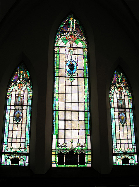
Overall, I think this is a good picture, and that you have used negative space to emphasize your subject. I do feel the framing/cropping is a bit tight, and as a result, feels off balanced. More space on either side, and more on top would have really made the NS seem dramatic, I think. The exposure seems to work well, as the colors are vivid without being blown out, and the focus seems okay. The details of the window are crystal clear, but I suspect that is a distance thing rather than a focus thing. The only thing that really bothers me about this shot is that even though it is straight (as can be evidenced by the bottom of the center window), it stills feels loopy to me. Some of it is probably distortion caused by shots like this, but it just feels like you need to move a few inches to your right when this was shot. I saw the comment about existing artwork, and though I many not agree with it, it may have been interesting to put someone or something in front of the window to create a silhouette. Someone praying or something. Of course, I don't know the logistics, but if it had been possible, it would have added a definite focal point to the shot.
I tend to see church windows as existing artwork, and I can't see what you've added to it. I also don't think the negative space here adds any kind of 'wow'. 2
The neg space of black contrasts well with the lighting. I think you've achieved a nice exposure here--not too bright that the colors and details are washed, not too dark either.
Wonderful colours on those windows! However, if it would have been possible, I would like to have stepped back a little backwards to stop the 'in the face' feeling I am getting at the moment from the huge dominating middle window. And the side sides are cropped a little too tightly.
I do not know if you intended for the windows to look like they were 'floating', but I would much prefered to see a little more wall at either side [if there was any]
Oh and I am a bit of a perfectionist, but I can see that you were not perfectly standing perpendicular to the wall so it looks a little slanted, but let me emphasise little. It would have just been a little easier on the eye if you were...