| Author | Thread |
|
|
06/06/2006 08:35:09 AM |
Hi !
What a nice photo ! I think it should have deserved a higher score , excellent execution ! |
|
 Photographer found comment helpful. Photographer found comment helpful. |
|
|
06/02/2006 06:11:09 AM |
Greetings from the Critique Club. My critiques are generally geared towards trying to help you improve your score within DPC, and not on any true "artistic" merit of the photograph itself, unless it relates to DPC voters and scoring. Please keep that in mind as you read this.
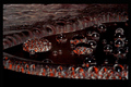
Initial Thoughts
Simple, engaging, and well representative of the challenge.
Composition/Content
While some of your commenters thought the composition needed a little work, I believe that it's quite strong as it is. You have some good use of negative space, and beautiful symmetry. I don't think that was your problem. Contentually, it might be a little.. "dull".. but not overly so, and the blue flame and symmetry of the shot really help. Simplicity is generally overlooked sometimes, and I quite like it in this case. You do have a distracting bright element in the lower right of the burner, which people probably noticed that throws things off more than it probably should.
Background
Nice, solid black.
Camera Work/Technical
A good exposure. The problem with the bright area I don't exactly know how to fix. You might have wanted to try to selectively burn that down a little so it didn't stand out so much, or perhaps some creative cloning. It really is the one critical detail, that stands out simply because of the darker image and the symmetry of the rest of the shot.
Digital Processing
As I said, working on the bright area would have helped a lot, I think. There are also a few artifacts remaining in your flames, giving them the "not DPC smooth" look that could have garnered a few subconciously low votes. Not sure if that was a product of saving it to jpg or something in your RAW conversion though.
Fits the Challenge
Well, I don't see how it doesn't.. Flames generally aren't cool :)
My Opinion of the Photo
A wonderfully simple take on the challenge that I, myself probably would have voted quite high. If it wasn't for the fact that you have one glaring bright spot throwing the image off a bit, and the fact that because of the simplicity that I personally like, you were probably given the "eh, not wow" vote, you might have scored much higher. I personally believe this is underrated, but it's DPC we're talking about here. While I have no suggestions on how to increase that all-important "WOW".. I think you shoud be proud of just giving us an image that is peaceful and contemplative.
P.S. Something I just thought of. Had you considered rotating this so that the flame ring was at the bottom of the image? That's a composition that might have increased the strength of the image as well. Just a thought. Also, as undieyatch pointed out.. you also fell victim to the "Too many similar photos in the challenge" syndrome. Which I despise, but is all too real. So unfortunate. However, it *is* true.. Getting a good shot is one thing, getting a good *original* shot is quite another.. so for future challenges, try to get that ol' thinking cap on and don't fall into the trap of shooting something that might be a very popular subject.
From experience though, that's harder than it sounds.
Message edited by author 2006-06-02 06:15:31. |
|
| Photographer found comment helpful. |
|
|
05/30/2006 11:41:14 AM |
|
| Photographer found comment helpful. |
Comments Made During the Challenge  |
|
|
05/28/2006 11:52:54 PM |
|
| Photographer found comment helpful. |
|
|
05/28/2006 09:59:20 PM |
| Back for a second look, bumping up. Great shot! |
|
| Photographer found comment helpful. |
|
|
05/25/2006 05:02:05 PM |
|
| Photographer found comment helpful. |
|
|
05/25/2006 02:09:13 PM |
| I like this, cool heat. 7 |
|
| Photographer found comment helpful. |
|
|
05/24/2006 09:41:56 PM |
|
| Photographer found comment helpful. |
|
|
05/23/2006 11:34:44 AM |
| Great composition and colours! |
|
| Photographer found comment helpful. |
|
|
05/22/2006 08:05:35 PM |
| This composition needs a little work. The image quality is very good. The subject matter could have been better. This picture could be a little more creative. |
|
|
|
05/22/2006 06:56:42 PM |
|
| Photographer found comment helpful. |
|
|
05/22/2006 02:09:50 PM |
|
| Photographer found comment helpful. |
|
|
05/22/2006 01:23:31 PM |
| this is almost a carbon copy of my entry, lucky i pulled it |
|
| Photographer found comment helpful. |
|
|
05/22/2006 12:59:57 AM |
| Very abstract image, like the blue color....7 |
|
| Photographer found comment helpful. |
Home -
Challenges -
Community -
League -
Photos -
Cameras -
Lenses -
Learn -
Help -
Terms of Use -
Privacy -
Top ^
DPChallenge, and website content and design, Copyright © 2001-2025 Challenging Technologies, LLC.
All digital photo copyrights belong to the photographers and may not be used without permission.
Current Server Time: 03/13/2025 04:49:32 AM EDT.