| Author | Thread |
|
|
06/05/2006 10:48:17 PM |
Trading Post -
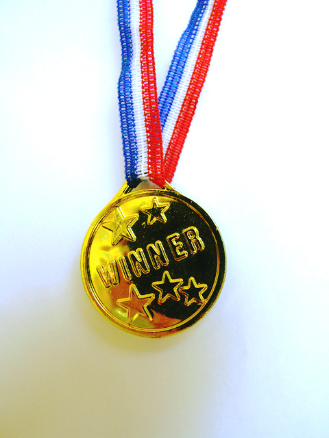
Good focus and colors but the background is really lacking. The shadows are a bit odd and the white just doesnt really do much for the overall pic. Now if you had your son wearing the medal with a big grin I think you would have conveyed success much stronger and had not only a better score but a fun pic of your child. The way it sits now leaves it kind of flat and boring. I scored it a 5 in the challenge. |
|
 Photographer found comment helpful. Photographer found comment helpful. |
|
|
06/04/2006 03:08:37 PM |
Composition
I would prefer the medal to be less centralized - maybe in the middle horizontally, but on the bottom third vertically
Technical stuff (exposure, dof, lighting etc�)
Focus is spot on, and exposure very good. I'm impressed with the lighting on the background to give a nice plain white b/g
Post-processing
Not much to say really, good amount of saturation, good contrast
Message/atmosphere portrayed
imho, if it were to include a grinning child, or the medal being held aloft for example, it would portray the desired feeling (of achievement, success, your kid's pride...) a lot more.
Meeting the challenge
Obviously
My personal opinion
Whilst all the technicalities are good, the way you have approached the theme (imho) gives a rather clinical, stock photo kind of feel, rather than the emotions associated with the feeling of success. |
|
| Photographer found comment helpful. |
|
|
06/03/2006 05:16:53 AM |
The focus is good, as are the colors of the medal. There are background shadows that distract from the subject. I didn't vote in this challenge but probably would have agreed with the majority. The photo lacks any "wow" factor, but instead looks like a stock photo shot.
I just noticed the title. Given that, perhaps the child should be in the picture too. I'm sure his/her grin would have been worth a bump in the score. |
|
| Photographer found comment helpful. |
|
|
06/01/2006 10:52:53 PM |
--Trading Post Comment--
Camera Work/Technical: Amazing focus! The detail that you captured throughout the image is very nice, and works very well to draw the viewer's eye around the subject.
Lighting: The lighting is a bit harsh, but not all bad. The gradient that you created from top to bottom provides some interest, but I think that it is just a touch too harsh, mostly on the top. The top area looks to be a little overexposed.
Composition/Content: Interesting, but I think it would have benefited if it were around the kid's neck with a big smile and funky pose.
My Opinion: You met the challenge, and I think that your score should have been a bit better based on the technical aspects alone. The composition could have been better, but I don't think that it's a sub-5 capture.
Eric
|
|
| Photographer found comment helpful. |
|
|
05/31/2006 11:33:43 PM |
Trading Post comment
Definitely meets the challenge! I think I'd like it a little less "middle" for some reason, or maybe kind of "hanging instead of what looks be lying rather flat. Colors are good, focus and sharpness are excellent. A bit of a color cast on the background - not sure if that can be removed using levels, but might be worth a try. Most importantly, though, tell your son congrats! |
|
| Photographer found comment helpful. |
|
|
05/31/2006 01:58:02 PM |
[[trading post]]
this image is unfortunately not very good, when shooting on a white background you need multiple lights to keep the shadows away, and that color smear on the background is really bad.
to get the background whiter in basic editing you can use selective color in photoshop and select the white channel, then turn the black down until the background is bright white.
but to get a higher score in this challenge I think the medallion has to be on the winner, to show a child as a winner always scores some points :) |
|
| Photographer found comment helpful. |
|
|
05/31/2006 01:47:08 PM |
I'll speak to the technical first. Focus is excellent. The image is nice and sharp. There are lighting issues. The top is too white while the bottom has shadow with color casts. The composition is static and centered. That isn't completely bad because a stock photo of a medal would probably naturally be centered.
A big limiting factor is the subject holds a lot more interest for you than the casual viewer. The title, I think, saves it, but not everybody reads the title. It's cute to thing how such a cheap trinket would mean so much to a child, but that is only conveyed with the title, not the picture. |
|
| Photographer found comment helpful. |
Comments Made During the Challenge  |
|
|
05/29/2006 11:50:37 PM |
|
| Photographer found comment helpful. |
|
|
05/27/2006 08:37:48 AM |
| very good lighting for a nice composition ! |
|
| Photographer found comment helpful. |
|
|
05/25/2006 10:15:41 AM |
| i would have liked it better on the child |
|
| Photographer found comment helpful. |
|
|
05/24/2006 03:42:09 PM |
| the shadow is a little off putting but a nice and simple idea |
|
| Photographer found comment helpful. |
Home -
Challenges -
Community -
League -
Photos -
Cameras -
Lenses -
Learn -
Help -
Terms of Use -
Privacy -
Top ^
DPChallenge, and website content and design, Copyright © 2001-2025 Challenging Technologies, LLC.
All digital photo copyrights belong to the photographers and may not be used without permission.
Current Server Time: 03/13/2025 04:39:08 AM EDT.