| Author | Thread |
|
|
06/06/2006 03:59:41 PM |
::: Greetings from Critique Club :::
Hi, as requested, here is an indepth critique of your submission.
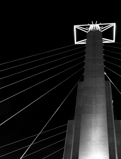
First Impression - the most important one:
It's a neat shot but greyscale comes out a bit flat in the midtones.
Composition:
You used the rule of thirds pretty well and the leading lines help to make a good composition.
Subject:
Subject is clear and composition helps to bring the eyes to it.
Technical (Color, focus, and light):
Color: As I said in my first impression, the greyscale conversion looks a bit flat to me. I really think a color version of this would have worked better.
Focus is sharp and not over-sharpenened in Post.
Light: Other than the highlights teetering on being blown at the bottom of the tower, lighting is pretty good.
To grow its vote?:
There were a lot of highly colored images in this challenge. I think the grey-scale hurt you in the voting.
Summary:
Overall a well compossed shot and interesting photo.
Hope to see more from you soon,
Leroy |
|
Comments Made During the Challenge  |
|
|
05/29/2006 01:02:15 PM |
| I wonder which of my city mates did this one... |
|
|
|
05/29/2006 05:55:51 AM |
| Is this one of those horrible things at bartle hall in KCMO? I like the DOF and the thirds |
|
Home -
Challenges -
Community -
League -
Photos -
Cameras -
Lenses -
Learn -
Help -
Terms of Use -
Privacy -
Top ^
DPChallenge, and website content and design, Copyright © 2001-2025 Challenging Technologies, LLC.
All digital photo copyrights belong to the photographers and may not be used without permission.
Current Server Time: 03/14/2025 03:45:23 PM EDT.