| Author | Thread |
|
|
06/06/2006 05:07:56 PM |
Hey there from the Critique Club
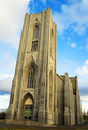
Camera Work/Technical: Nice focus, but I think a deeper depth of field would help. I'd like to clearly see the columns in the background as well.
Lighting: Your lighting is a little flat. The shadows in the column heads help out a bit, but this one needs a bit more contrast.
Composition/Content: The centered composition hurts this one. Perhaps standing a bit either side would have made this one even more appealing.
My Opinion: I think that you met the challenge well, and that this one scored close to its potential.
Eric
|
|
 Photographer found comment helpful. Photographer found comment helpful. |
Comments Made During the Challenge  |
|
|
06/03/2006 09:13:19 PM |
| It needs a bit more contrast, you've got some keystoning going on so I would have either straightened it out using perspective crop or else removed the left bit of the image which makes it so obvious. It also looks a tad soft but that might be the image reduction. |
|
| Photographer found comment helpful. |
|
|
06/01/2006 09:27:45 AM |
|
| Photographer found comment helpful. |
|
|
05/29/2006 12:58:48 PM |
| I love this! Looks like it was taken at Cave Hill Cemetary in Louisville, KY. Nice lighting! |
|
| Photographer found comment helpful. |
|
|
05/29/2006 12:48:29 PM |
| The crop follows the column but it's just too boring for me im afraid. |
|
| Photographer found comment helpful. |
|
|
05/29/2006 12:46:59 PM |
|
| Photographer found comment helpful. |
Home -
Challenges -
Community -
League -
Photos -
Cameras -
Lenses -
Learn -
Help -
Terms of Use -
Privacy -
Top ^
DPChallenge, and website content and design, Copyright © 2001-2025 Challenging Technologies, LLC.
All digital photo copyrights belong to the photographers and may not be used without permission.
Current Server Time: 03/14/2025 06:18:17 AM EDT.